Design Better Extended: CRL Interior Designs proposes to revive the wonder at PCMC
Inaugurated in 1980 in the presence of diplomats and royalty, the Philippine Children’s Medical Center (PCMC) was dubbed “Lungsod ng Kabataan” or Children’s City, and alternatively, “A Wonderland for Children.” The government institution was to provide excellent healthcare for children and subsidies for families who could not afford such services on their own. For some 20 years, children of different social strata shared the Lungsod ng Kabataan’s mural-covered lobbies and waiting areas.
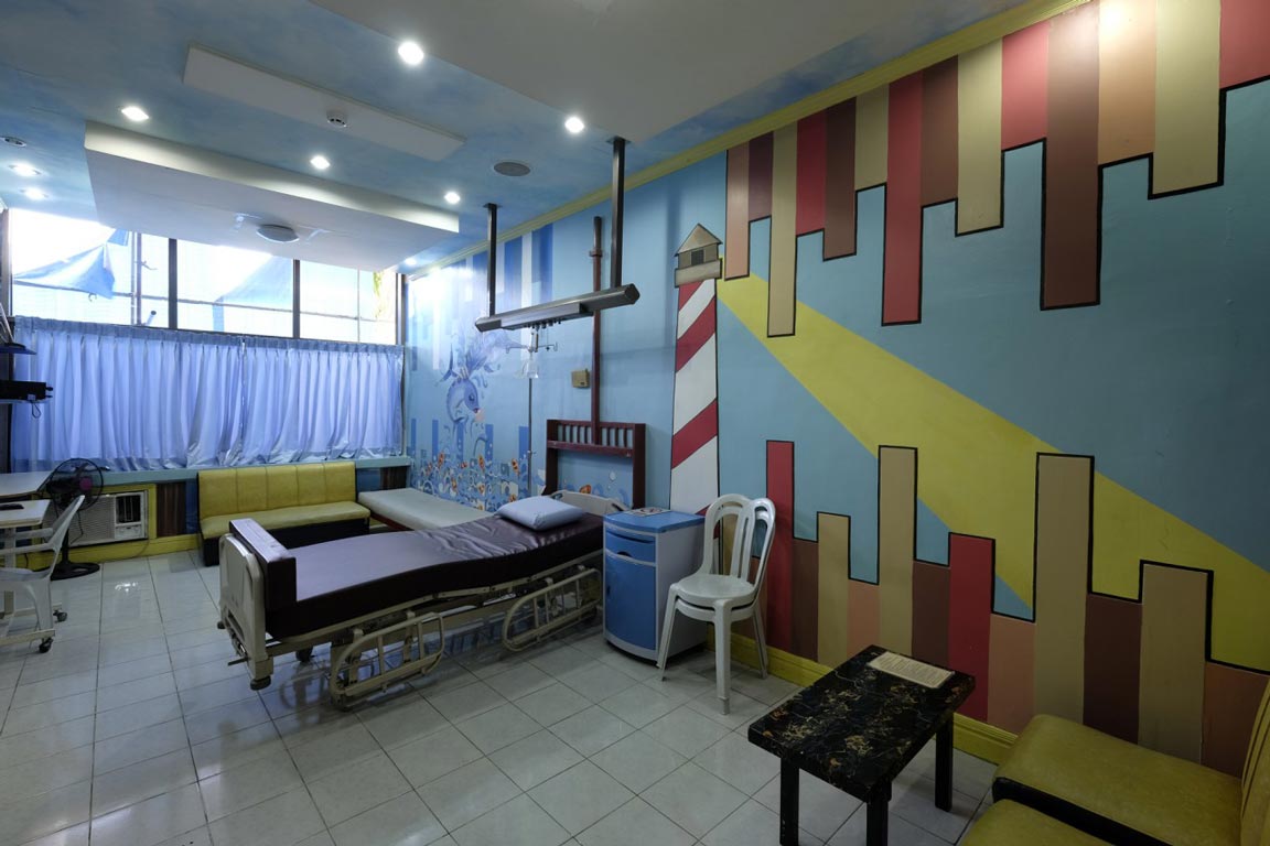
Due to lack of funding and maintenance, what once was a beautiful government hospital is now dilapidated and its facilities outdated. The murals in the lobbies have faded, portions of which have been crudely painted over in past repainting attempts by volunteers. Decorations such as animal-themed wall treatments are peeling off in the dark hallways. To add to the matter, there is no unified design as donor-funded renovations were done in patchwork.
CRL Interior Designs proposes to redesign the Lungsod ng Kabataan interiors so it can live up to its epithet, “A Wonderland for Children.” Although the Department of Health released guidelines for the planning and design of hospitals in November 2004, there are no prescriptions for children’s facilities. Through Children’s Eyes, a 2008 study published in healthcare design journal World Health Design, identifies factors that improve pediatric environments. These include nurturing children’s positive frames of mind by minimizing difficulty and boredom, and allowing them to be engaged in the experience of hospitalization.
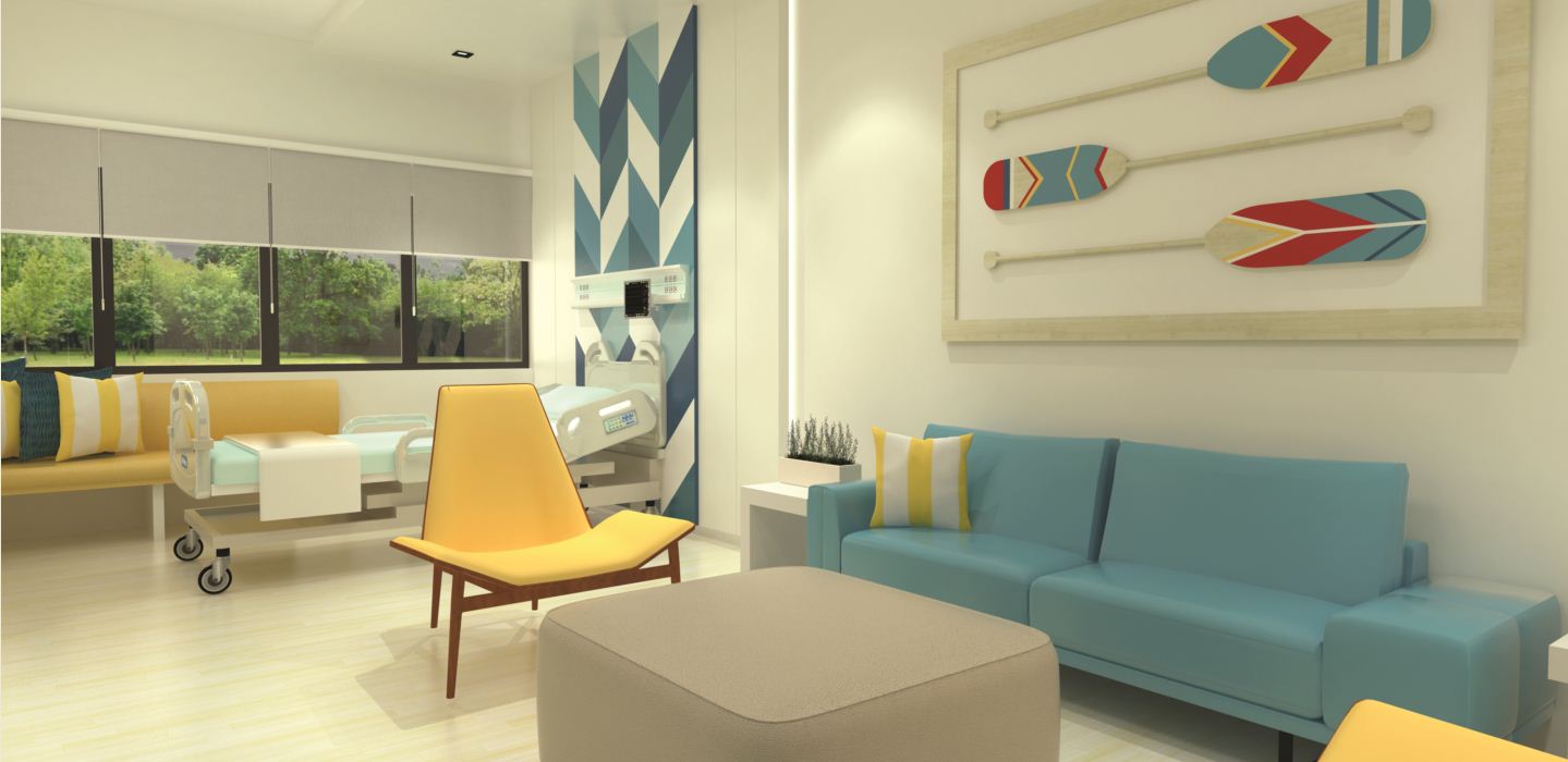
Our approach is to balance the cleanliness of the hospital with vibrancy and playfulness. Bright tiles and antimicrobial coated vinyl are predominant on floors and walls so that dirt can be easily spotted and cleaned. The current hospital decoration of children’s toys, large lettering, and animals informed our concept of rainbow-colored details that spark wonder, unify the hospital spaces, and double as wayfinding devices.
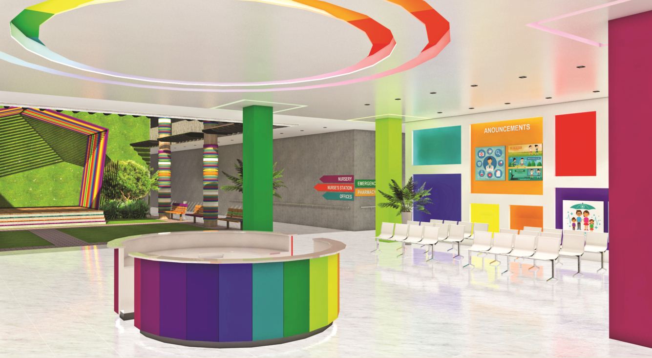
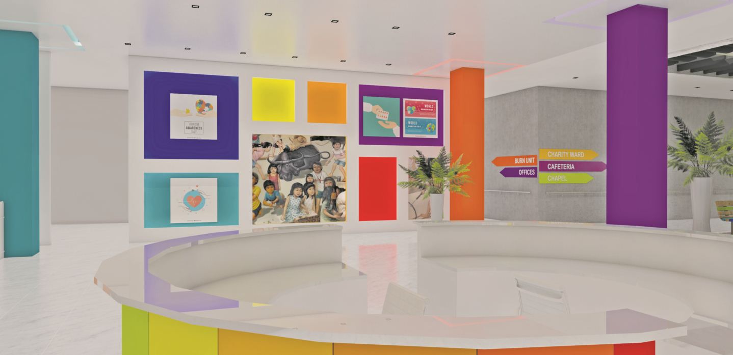
Main lobby
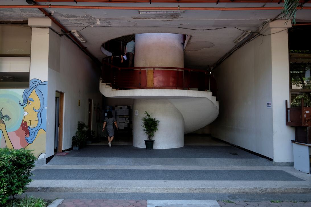
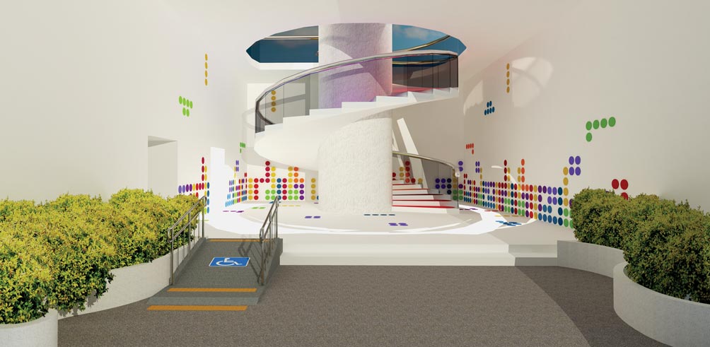
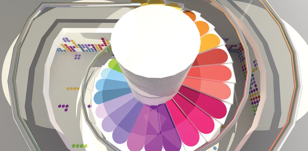
The PCMC is known for its wall murals. Jovial images of children at play and in traditional garb are characteristic of the hospital arrival area. However, if the state of the hospital entrance sets the tone for the experience ahead, the current lobby with its shabby walls and lack of seating will already incite some anxiety.
“The murals must be retained,” requested Lungsod ng Kabataan deputy director Dr. Vince Gomez, who says the paintings are significant because artists who have since become respected maestros did them. Since the murals have lost their integrity, we propose cleaning and keeping them out of harm’s way until expert art restorers can work on them.
A double wall cladding will contain niches for announcement posters and LED screens. New seating will make the reception area comfortable as patients wait for their appointments or transport. The reception table will be transferred to the center of the room so checking in can be done in the lobby instead of by the driveway.
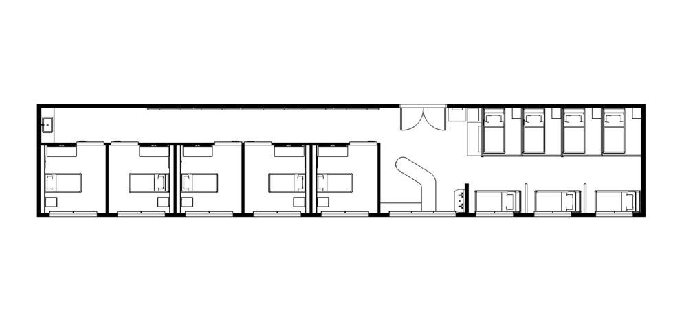
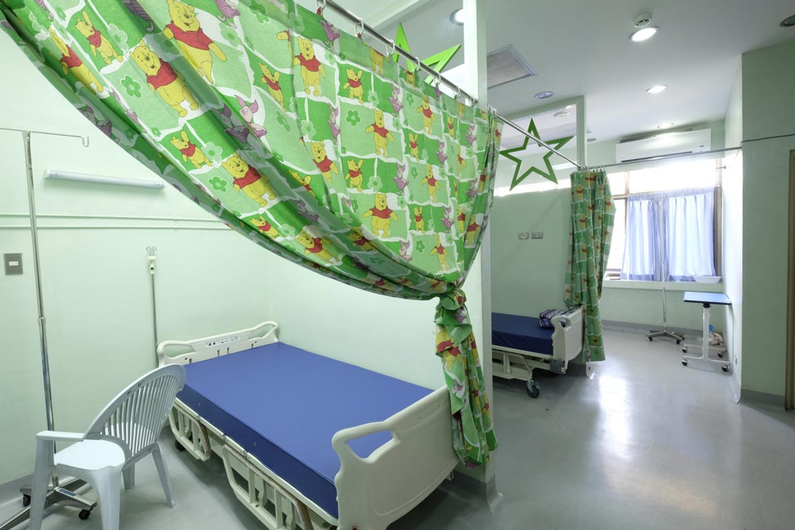
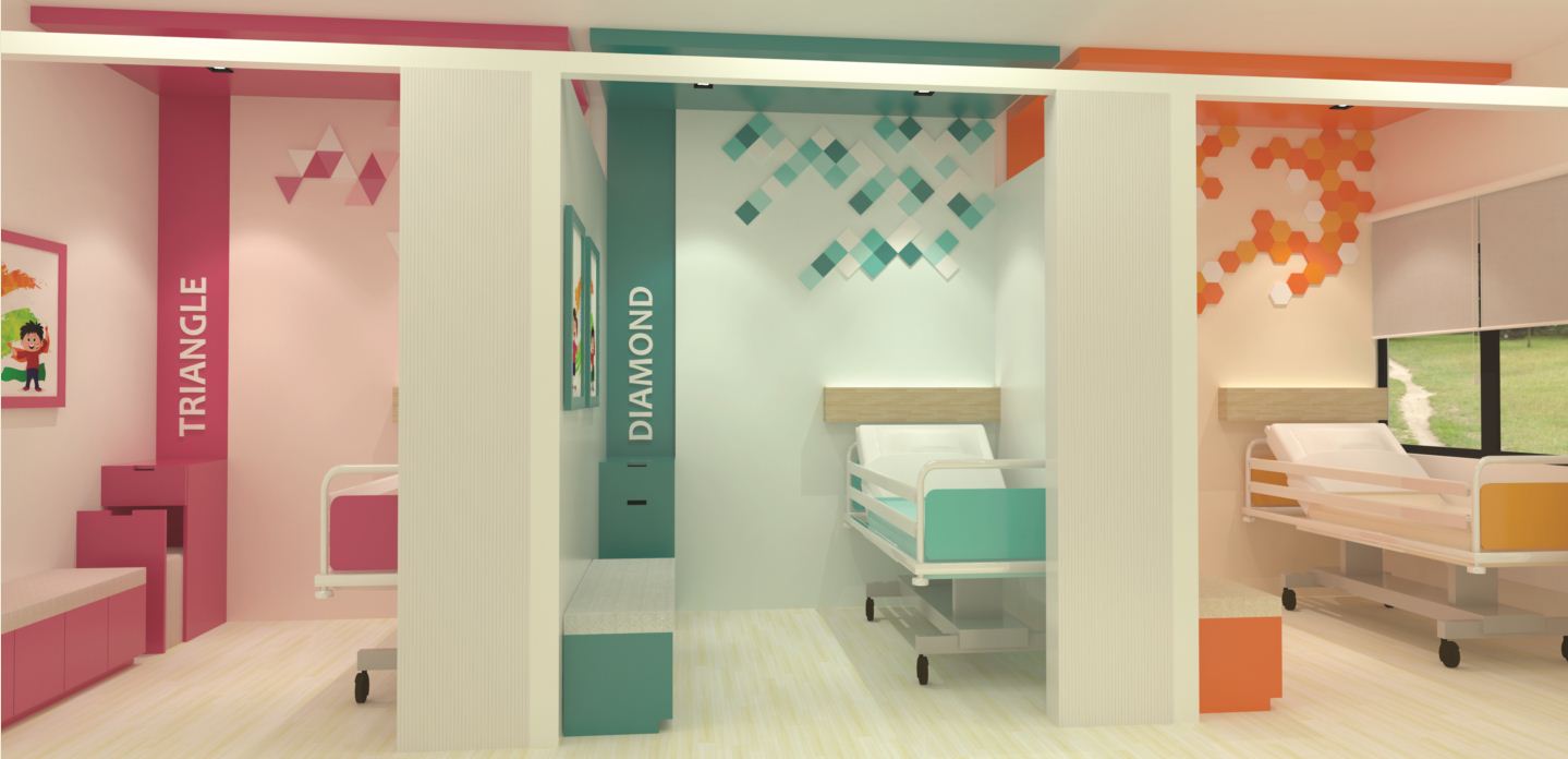
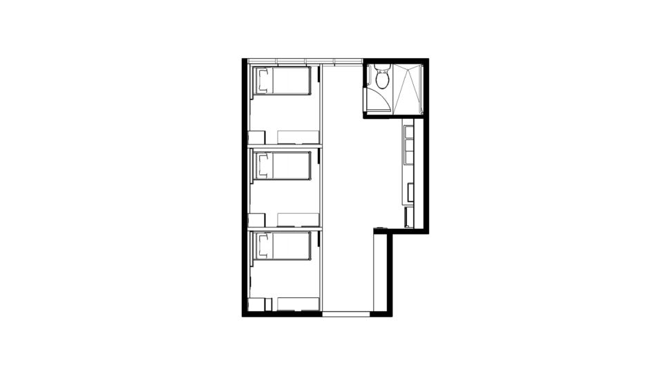
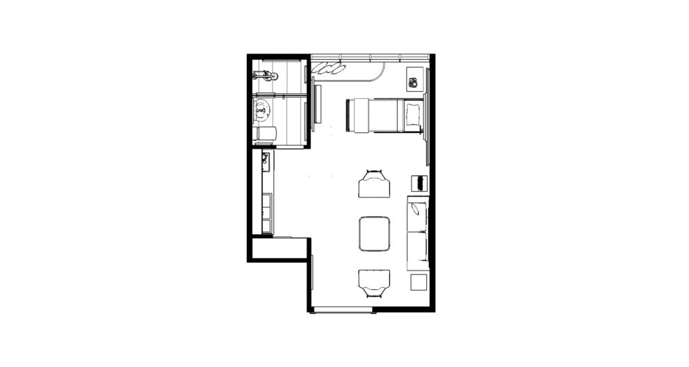
Rooms and wards
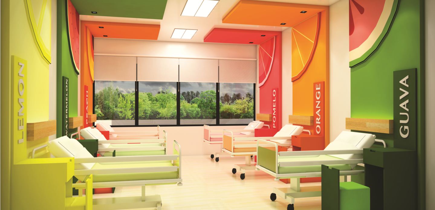
We will imbue hospital accommodations with a sense of place through colorful cutout silhouettes and distinct themes per room. Familiar objects such as shapes and fruits will compose room details. Recognition of concepts and bold colors make the spaces less threatening to children. On top of being fun, the varied themes will enable patients to easily remember and have a sense of ownership of their rooms. Even charity wards, which are currently austere and uniform, are given individuality through themed bedframes. Cutouts made of Plyboo, a durable and waterproof plywood made of bamboo, add texture to the room interiors but can also serve as positive distractions when the patient is experiencing pain.
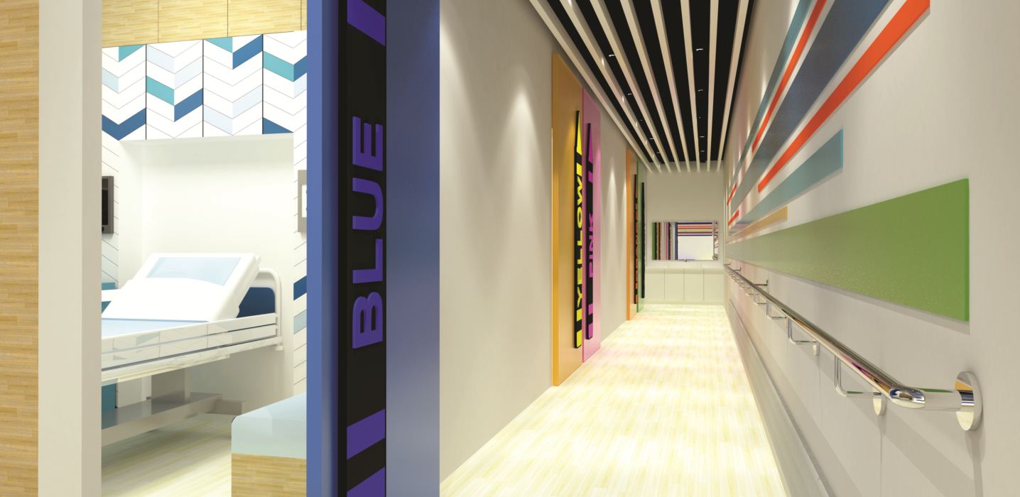
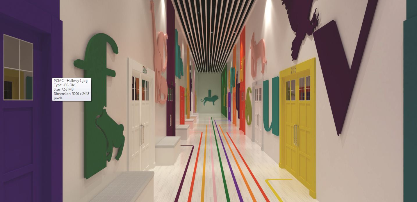
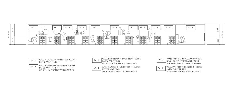
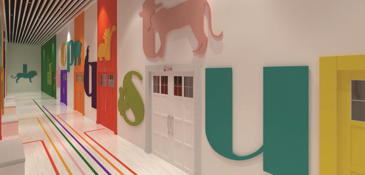
Hallway wayfinding
The Lungsod ng Kabataan is almost four decades old and, with minimal upgrades, its lighting design is outdated. Big windows oriented towards the courtyards bring natural light into hallways, rooms, and offices in the daytime. But at night, the 4-meter-high hallways are dark. Being the main circulation paths for patient rooms, these paths need clarity. The hospital’s current hallways are decorated with large letters corresponding with animals. We decided to improve this idea.
The mismatched cartoony illustrations on the hallway walls are made minimal and painted in solid colors. More than just pretty images, the sequence of decorations help establish the chronology of rooms. Besides being given more legible signage, doors are painted in distinct colors. Colored lines, corresponding and leading to each door, trace the hallway floor. There are multiple ways to find a room, but special attention is given to making it engaging for children, empowering them to be active agents in their hospital experience.

Non-medical spaces
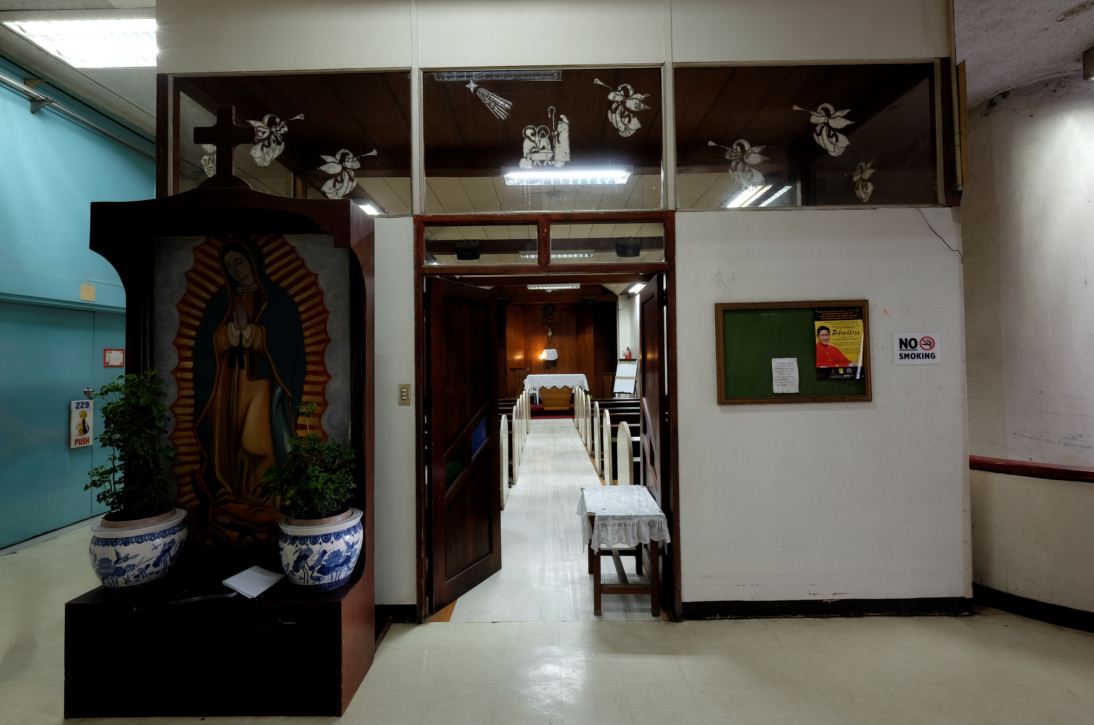
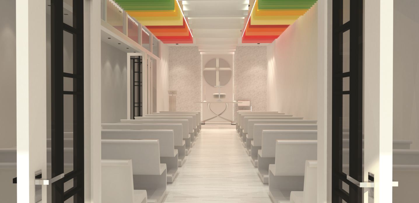
The current chapel is a 60-square-meter enclosed area on the second floor of the hospital. With no windows to the outdoors, the current area is totally reliant on artificial light and furnished with old pews. We propose to transform the aged and stuffy chapel into a meaningful space for prayer. In line with our direction for the rest of the hospital, we reduced surface colors to white and installed better lighting. A colorful ceiling evokes the sense of hope from above.
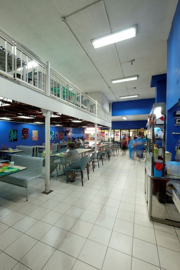
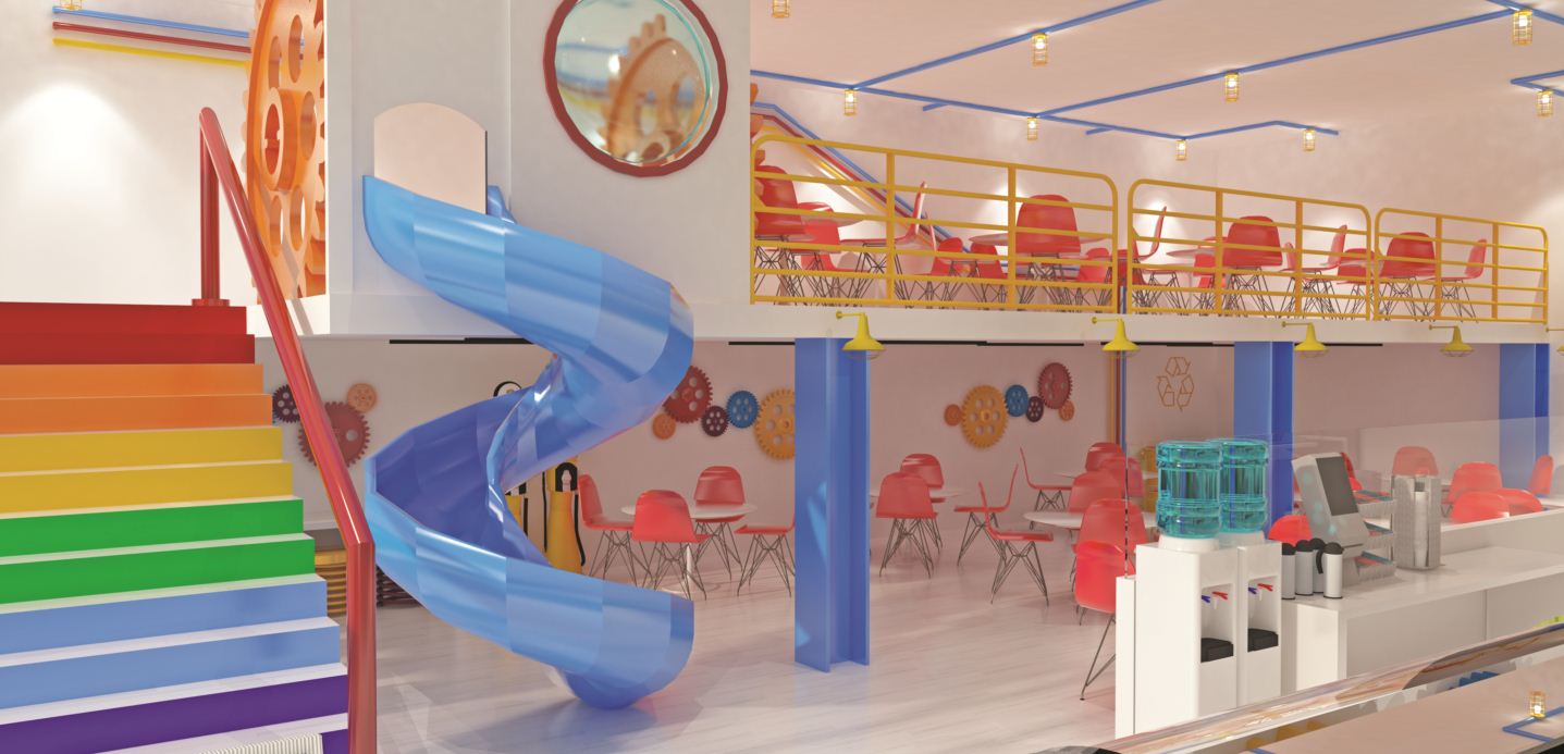
The current cafeteria has a mezzanine on one side and standard food service set-up on the other. We propose to give the space more character and make it more interesting for hospital visitors and staff by refreshing the interiors with colorful and interactive elements.
Bringing back wonderland
PCMC is a familiar place because my son’s pediatrician is based here. The rooms are spacious, so are the nurse stations and hallways. Three buildings with courtyards allow ample circulation and open-air areas unlike other hospitals where clients have to navigate snaking corridors. One can sense that it was one of the most efficient children’s hospitals in Asia, if not the most efficient, during its prime years. My husband, who was a regular patient as a child, told our team: “You should have seen this before!”
During our visit, Dr. Gomez discussed the upcoming expansion plans on the third level of the existing building. This means offices will move up and create space on the second floor for additional facilities. The Lungsod ng Kabataan was built to house premier children’s’ healthcare services. By creating a relatable hospital environment, we envision young Filipinos, rich and poor, feeling welcomed and empowered in PCMC.