Isabel Gatuslao submits Kusama-esque theme park brand identity
“I was a terrible, terrible, student,” begins the graphic designer, sipping her tea. “I didn’t know there was such a thing as a course in Graphic Design, but I’d always been doing graphic design since I was a kid. Movie posters fascinated me. I never looked at the actors but the titles and credits. I’d look at typefaces and say, ‘Hey, I know that font!’ Or I’d see a logo and think, ‘I know how to do that!’ And I’d go to my dad’s computer and try to recreate it. I was the weird child.” Isabel Gatuslao may have been weird, but everyone in school sought her out.
“My dad was a geek—whatever computer or gadget came out, he’d be the first in Bacolod to have it. So I was the first kid in school with a color printer at home. At the age of ten, I made an album presenting different fonts and different sizes of paper, which I’d show to my classmates. And then they’d order personalized stationery from me, which I’d wrap in little plastic packages.”
That was a big deal for little girls in sleepy Bacolod in the 1990s because they didn’t have a National Bookstore or anything close to it. “Later on,” Gatuslao continues, “I made all their birthday invitations. Cousins would come when they needed posters, reports and Powerpoints done. The computer was my thing. I enjoyed that more than school.”
Education continued to be a necessary tedium for Gatuslao until after college, when she decided to leave Bacolod for Manila and try a certificate course at the Philippine School for Interior Design. She was shocked to find herself good at school. “I did so well drawing perspectives it gave me confidence. The teachers there were so strict but I loved it. I learned I had spatial intelligence. All of a sudden, school was fantastic!
After doing PR and marketing for Hyatt and then Nike, Gatuslao found the pluck to pursue graphic design full-time, designing brand identities for such clients as National Bookstore, Chat Fores, and Ito Kish; rebranding the untouched 100-year old identity of Squires Bingham International (the largest arms company in the country); and even designing a size-16 shoe for basketball MVP Lebron James for his visit to Manila in 2015.
READ MORE: Punong: A nature-embraced family retreat in Silay by Ed Ledesma
Then, Gatuslao enrolled last year at EINA, University School of Design & Art in Barcelona, for her Master’s in Graphic Design. The experience was nothing short of life affirming. “Mind blowing” is Gatuslao’s description, better than the trippy-ness of her Bacolod youth. So inspired was she by her year-long, monk-like existence in the hills of Catalonia, she wants to go back for another year to bury her nose in the esoteric, fine art of designing typefaces. EINA apparently whetted her appetite for the rigors and exacting attention to detail of designing fonts (fonts are kind of like to typefaces as songs are to albums), which she did as a matter of course for several design projects, including her Proyecto Aplicaciones under the internationally awarded Martí Ferré, for which she received the highest grade in her class.
The Challenge
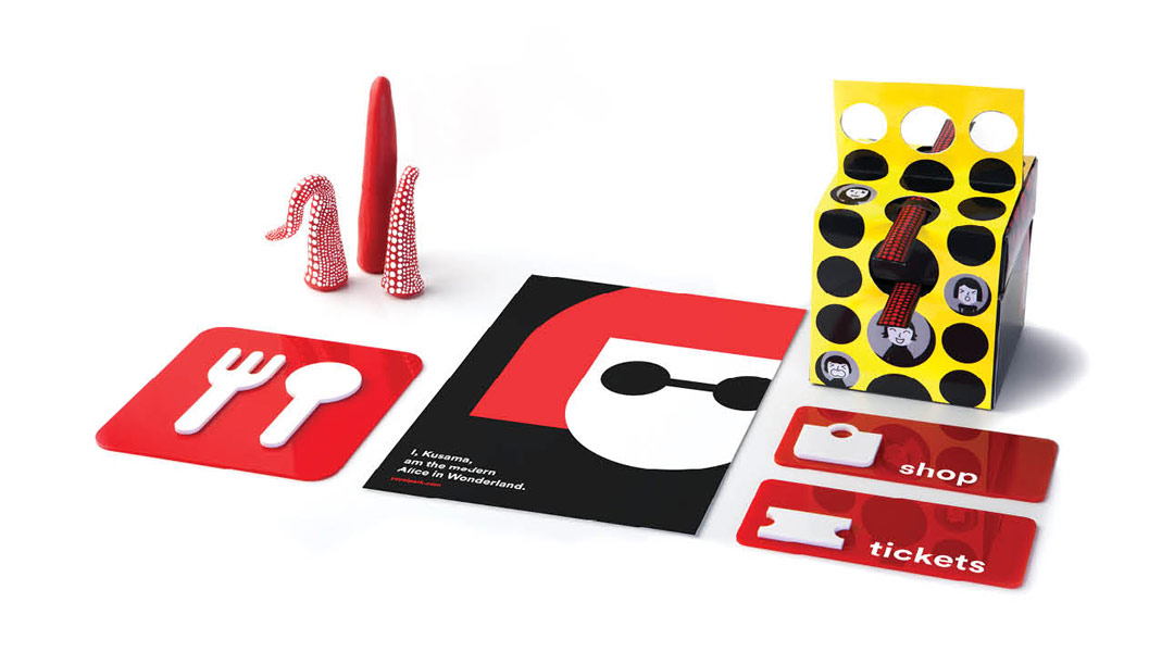
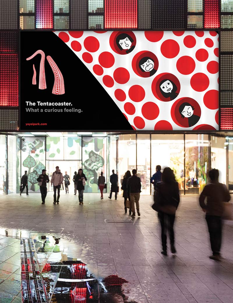
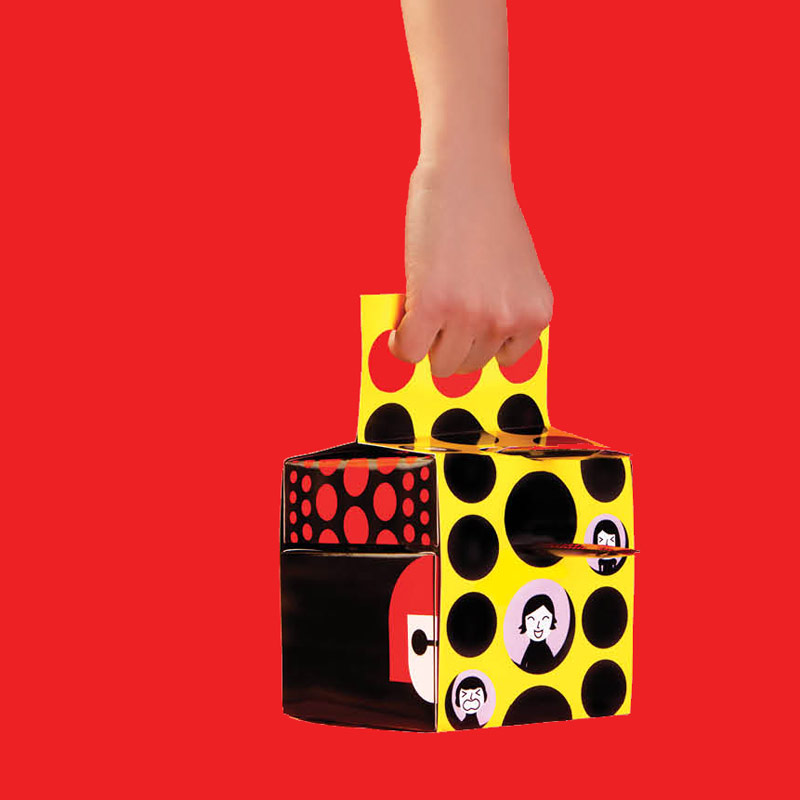
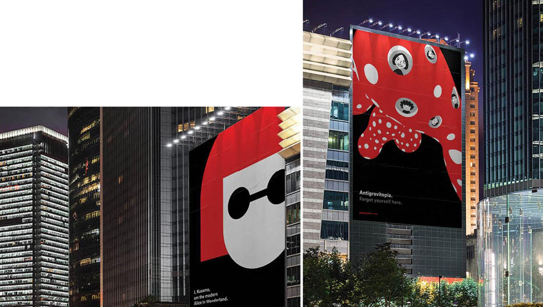
To design the identity system of a theme park of choice (including made-up ones), with the condition that “each element of the system look cohesive and recognizable without the use of an official brand logo.” The objective of the exercise, recounts Gatuslao, was to imbibe that graphic design does not revolve around the logo: “Our teacher wanted us to learn that good brand identities are recognizable from afar, even when the logo isn’t there.”
Solution
As a fan of Japanese artist Yayoi Kusama, Gatuslao proposed “a theme park that would allow visitors to physically experience her weird, hyper hallucinogenic art by transforming her pieces into grand-scale park rides.”
Typography
Isabel Gatuslao used the round typeface called Circular as a nod to “Yayoi’s consistent lifelong obsession with the polka dot.” She adds: “Circular is a very new, awkward, almost cartoony typeface—it’s so round, look how wide the g is! Not as sophisticated as Helvetica.” The use of Yayoi’s trademark colors, solid red, black, white, and yellow, create a clean and very Japanese backdrop for the various applications.

The result
“Every week,” Gatuslao recalls, “we had to submit something. The first week was, what typography are you gonna use? What color? What imagery? And then, our teacher’s rule was to ‘Eliminate, eliminate, eliminate as much as you can!’ Martí Ferré always challenged our designs. He was always like, ‘What is that thing there? WHY is it there?’ Everything has to have a reason. And it has to entertain, be emotional, be relevant.”
There was no detail too small to escape Ferré’s notice. And Ferré noticed that there was no detail too small for Gatuslao’s lavish attention. The result is entirely endearing, wonderful and weird. Her Proyecto Aplicaciones, along with her Proyecto Final (featured in Volume 3, 2016), was among the chosen few of her batch to be exhibited last January 2016 at the Espai Barra de Ferro in Barcelona, a distinction reserved for the best works by EINA students.
In a few months, Gatuslao goes back to Barcelona to fuss over minutiae such as serifs, ears, tittles and spurs. “Some typefaces take two years to make, some take ten—some take forever!” She can hardly wait. It’s the small details that make perfection, and for Gatuslao, perfection is assuredly no small thing. ![]()
![]()
