Lessons on small design from WOHA (and Nick Joaquin)
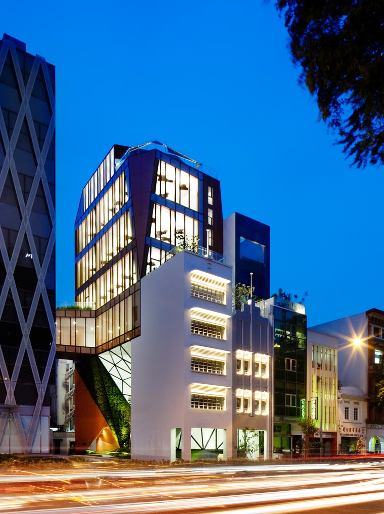
In 2012, top Singaporean design firm WOHA was chosen to design the annex building of Maybank Kim Eng Properties along North Canal Road at the border of Singapore’s Chinatown district. At 326 square meters, the site for the annex is small compared to the corner block occupied by the main building designed by Kenzo Tange. The brief was to design a boutique office, and rebuild the two shophouses demolished in the same site that were listed for their heritage value. These limitations allowed the designers to come up with a creative set of solutions that revealed their focused sensitivity and empathy to the building’s users and the public at large. While the design gestures were small, their impact on public behavior is compelling.
Filipino historian and writer Nick Joaquin, in his eternal search for the country’s social and cultural identity, wrote a polarizing essay called “A Heritage of Smallness.” In it, he proposed three theories on why the Philippine nation is where it is, and may remain where it stands. First, he accused the Pinoy of being “adequate at the challenge of the small, but cowed by the challenge of the big.”
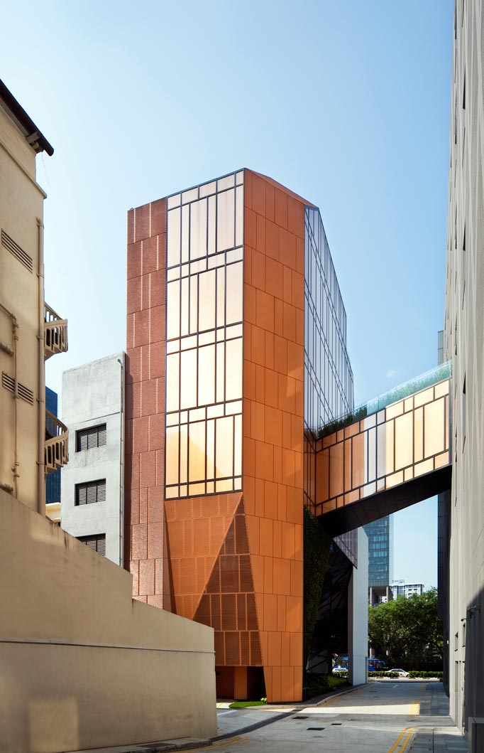
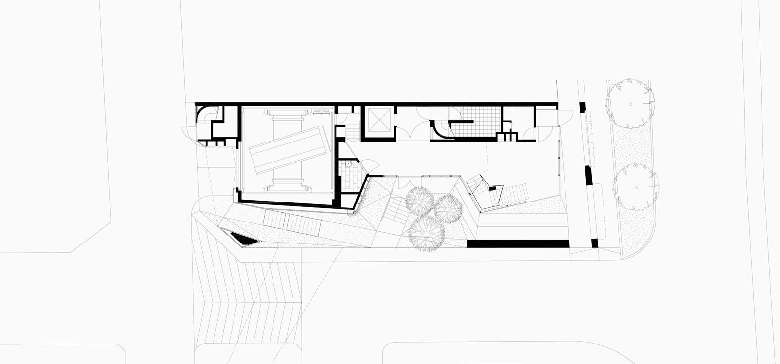
To harmonize the requirements of adding more office space for the users and preserving heritage, WOHA designed two buildings conjoined at the arterial spaces. The first building is a faithful but innovative reconstruction of the two shophouses in front. For these heritage structures, WOHA commissioned the services of artisans to repair and reconstruct where needed, the turn-of-the-century ironworks on the window frames and hardware.
READ MORE: BluPrint’s tropical book series covers Singapore, Malaysia, and the Philippines
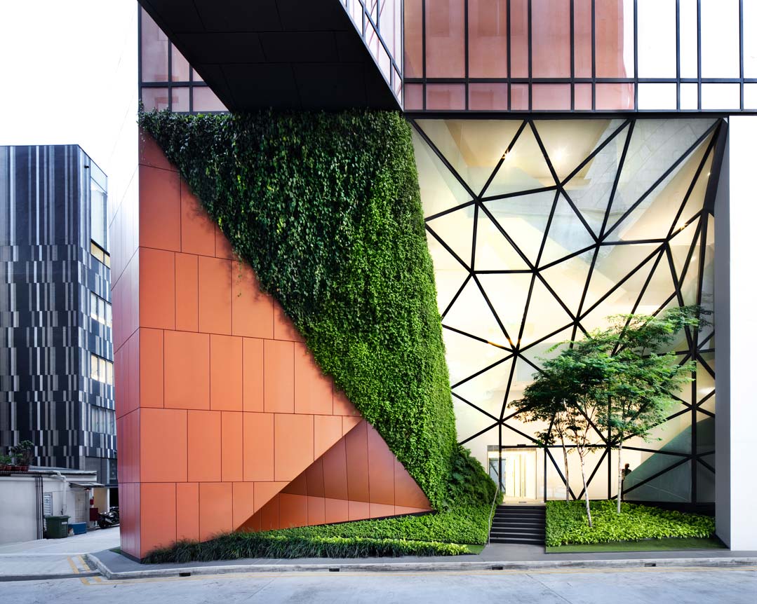
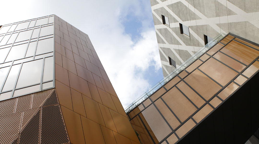
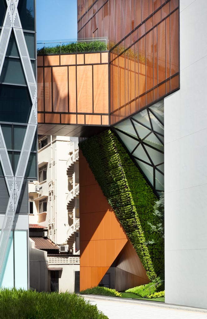
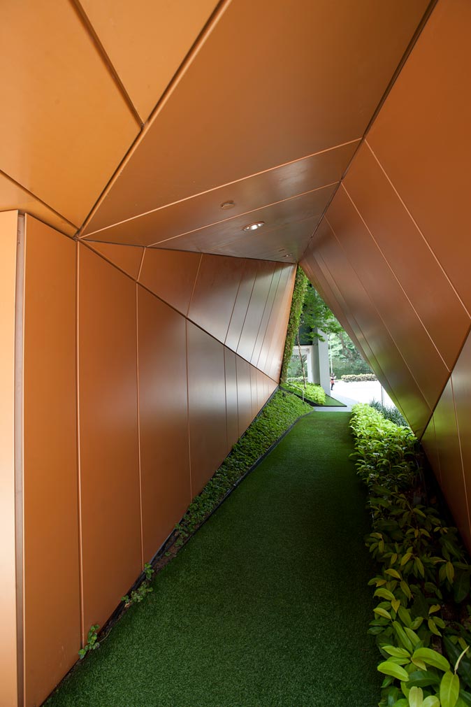
The second building is a nine-storey structure behind the shophouses with a glass and aluminum surface, a clear counterpoint to the period style of the shophouses. This modern building’s bottom-to-top “design thinking” strategy comes from its response to context, and by folding the walls of the building inward as it touches grade, vistas to the interior of the otherwise “threatening” service alleyway are opened up. WOHA’s headquarters is located right behind, so whether this gesture to humanize the alleyway corner by chamfering was done for the public’s benefit or merely to enhance the access of WOHA employees to their office building, I can only speculate. Nevertheless, the program works successfully.
The designers’ decision to provide a strong modern counterpoint to the period buildings is a big leap that could have resulted in a clumsy landing, but they leapt just the same. It would have been so easy to just copy the shophouse style by adding five more floors of the same. Instead, the architecture took on the challenge of progressive heritage management rather than the safe and dishonest route of producing facsimiles of period styles.
Second, Joaquin proposed that Filipinos identify more with soft materials like fiber, bamboo and hide—materials that yield rather than resist. Our ancestral crafts, he claimed, did not develop on the large-scale to use more permanent materials like stone and metal, leaving us with only token jewelry and armaments, and an entire industry of baskets and place mats. It reveals our collective psyche, one anchored on servitude rather than conquest. It tells of tentativeness and transience. What we have claimed as ours we let go at the slightest signal of discomfort.
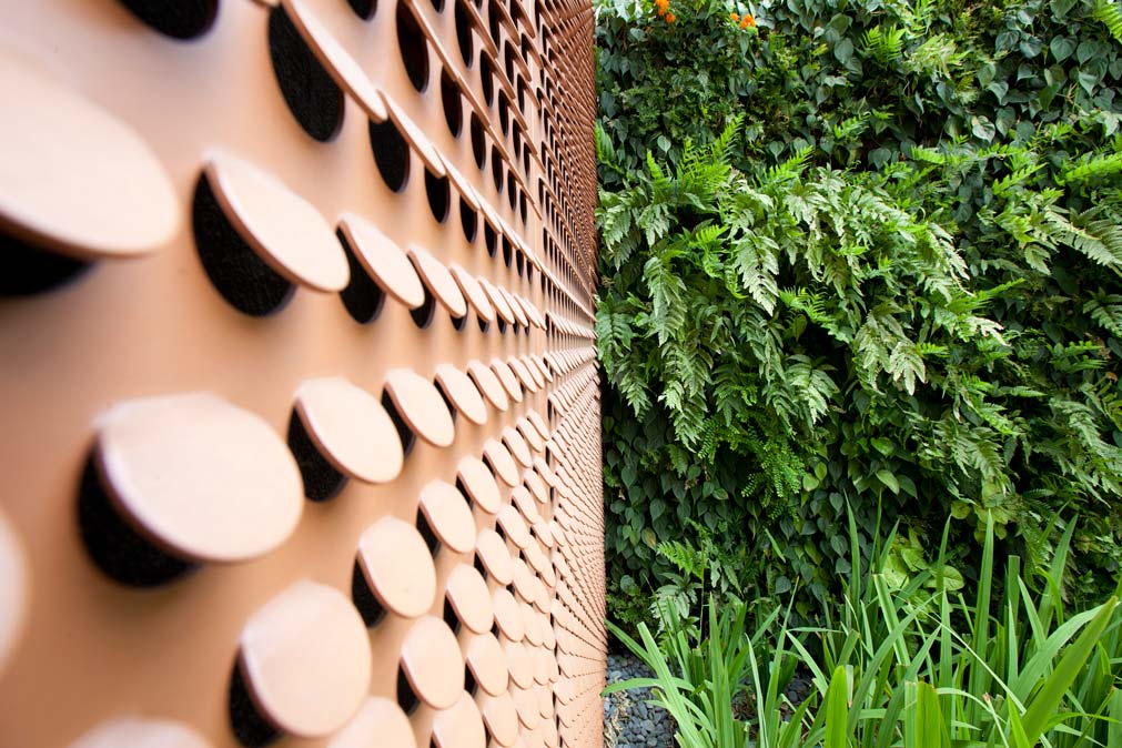
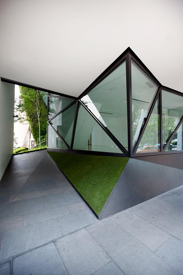
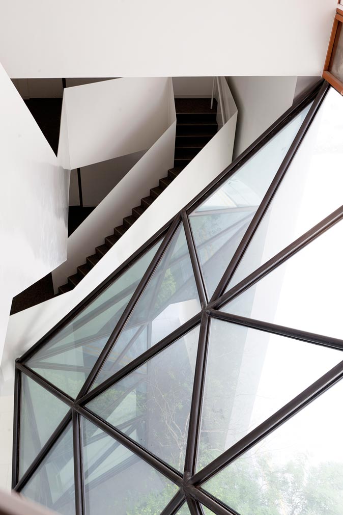
48 North Canal established a firm response to the Tange project by the use of fractal geometry generated by following through on Singapore’s Urban Redevelopment Authority requirement of splaying the corners at the alleyway turns. This geometry was echoed with impressive discipline, being careful not to over do it, both outside and inside. The decision was not of the neither-here-nor-there language; but exacting, as it makes bold conversation with the Tange building, which by comparison is the weaker conversant. The management of the public realm by the Tange building is poor compared to the creative appointment of 48 North’s “short-cut” tunnel, garden wall and mini park provided by the WOHA team to the annex building. Building materials used for such a small exercise are undeniably superior. Full plates of steel holding the stairs as solid rails winding in and out of the building are complemented by thick perforated aluminum panels that solidly shade the building while ventilating it at the same time. While articulated in a small space, the gesture is big, firm, permanent and insisting.
Joaquin argues this third point: in the face of threat from foreign technology, we refuse to innovate to overcome the threat and simply repeat safe and tested formulas over and over again. This has kept the Filipino in the small universe of the processed capiz shell picture frame, rattan magazine rack and the bamboo iPhone amplifier. And while our bamboo and coconut sandok gathers dust on a wall somewhere awaiting the next barrio fiesta, the invading technology acquires our materials, and innovates to come up with strengthened bamboo that is a sustainable alternative to aluminum as columns for curtain walls of buildings. Our response to external threat is simply lame.
Design Thinking as an approach to innovation and problem solving is foreign to Singapore. But since the government has declared design a national priority, the government has been encouraging designers and businesses alike to leave the comfortable realm of purely functional and deterministic design so typical of the High Modernism, and enter the world of user empathy and experience. This is in response to the external threat of globalization, and an urgent need for a unique selling proposition to be embedded in the Singaporean product. While it is a foreign design doctrine, Singapore embraced it just the same.

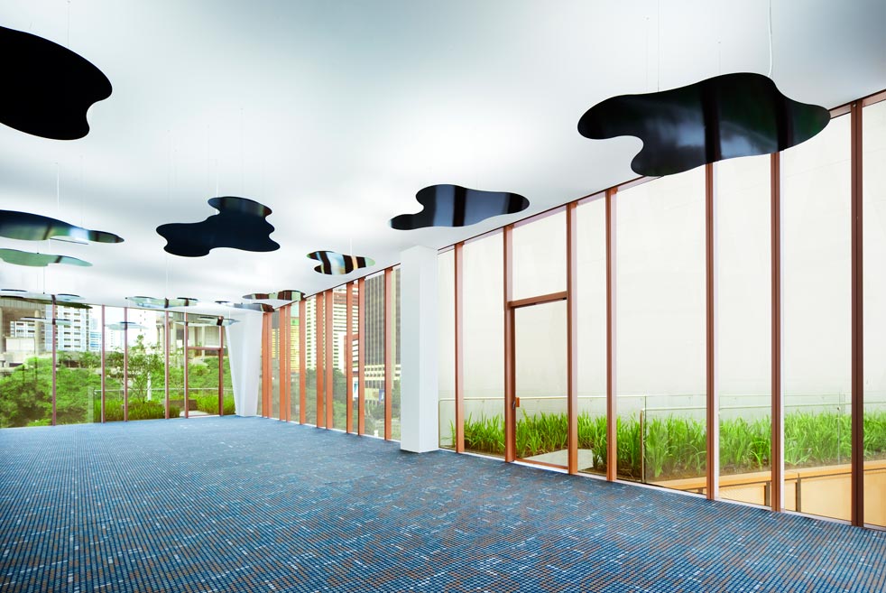
WOHA, a firm advocate of this program, demonstrated user empathy in their adaptive reuse of the building on 48 North Canal Road. Departing from the equation of more enclosed floor space equals more revenue; the building generated three roof decks at various levels, all appointed with greenery and an unobstructed view of another WOHA project—Park Royal Hotel on Pickering across the block. This gives opportunities for pleasant breaks and even creative discussions al fresco. The temptation to produce a safe but stale box for that extra wad of cash in space rentals was resisted to make way for innovation, better working conditions and hopefully, increased productivity.
I rant alongside Joaquin on the Filipino’s failure time and again to embrace greatness and innovate. One may argue that we excel in feelings, warmth, hospitality and service. We cannot, however, be forever processing our feelings and serving others. We urgently need to respond to the imminent ASEAN economic integration that will happen in a few months. 48 North Canal is a good template on how to think big and aspire for greatness in a platform not necessarily large. Big ideas do happen in small designs. ![]()
![]()
This story first appeared in BluPrint Volume 4, 2014. Edits were made for Bluprint.ph.
READ MORE: Understanding BERDE, the Philippines’ green building rating system
