Substance and Light: SpaceFabrik’s Brise-soleil Residence
A modernist tropical home provides an orthogonal oasis shielded from the chaos of metropolitan life.
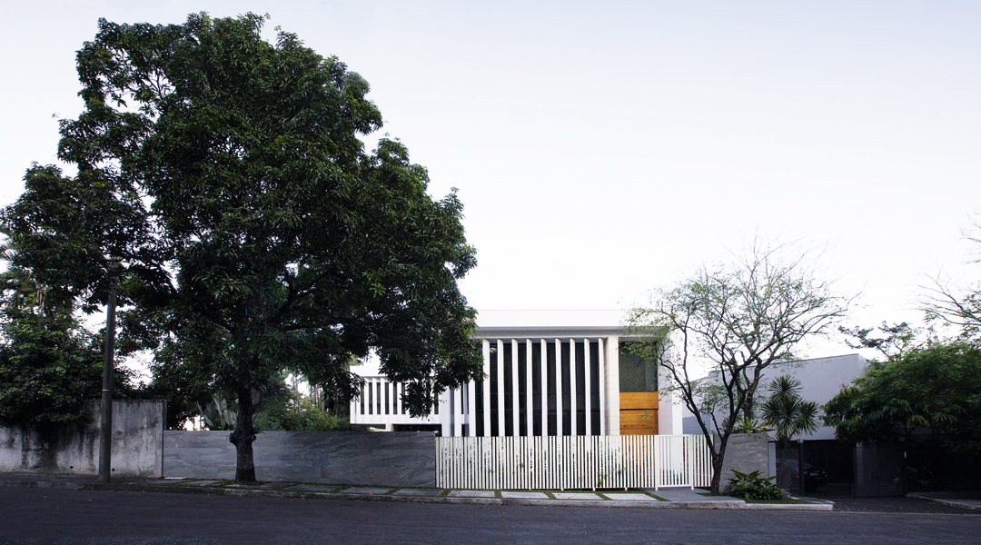
Within one of the most highly urbanized cities of Metro Manila, a modernist tropical home by SpaceFabrik provides for its occupants an orthogonal oasis shielded from the chaos of metropolitan life.
While privacy was a major requirement for the house, creating lightness and permeability was also emphasized and presented a challenge. This brief enabled Stephanie Tan-Branquinho, principal architect of SpaceFabrik, the creative freedom to pursue her firm’s aesthetic. “The play of volumes is something one rarely sees in local residential architecture,” observes the architect. “Externally, it doesn’t take much to imagine the interior and where everything is—but you rarely see houses where the spaces are articulated and described by the enveloping volumes.”
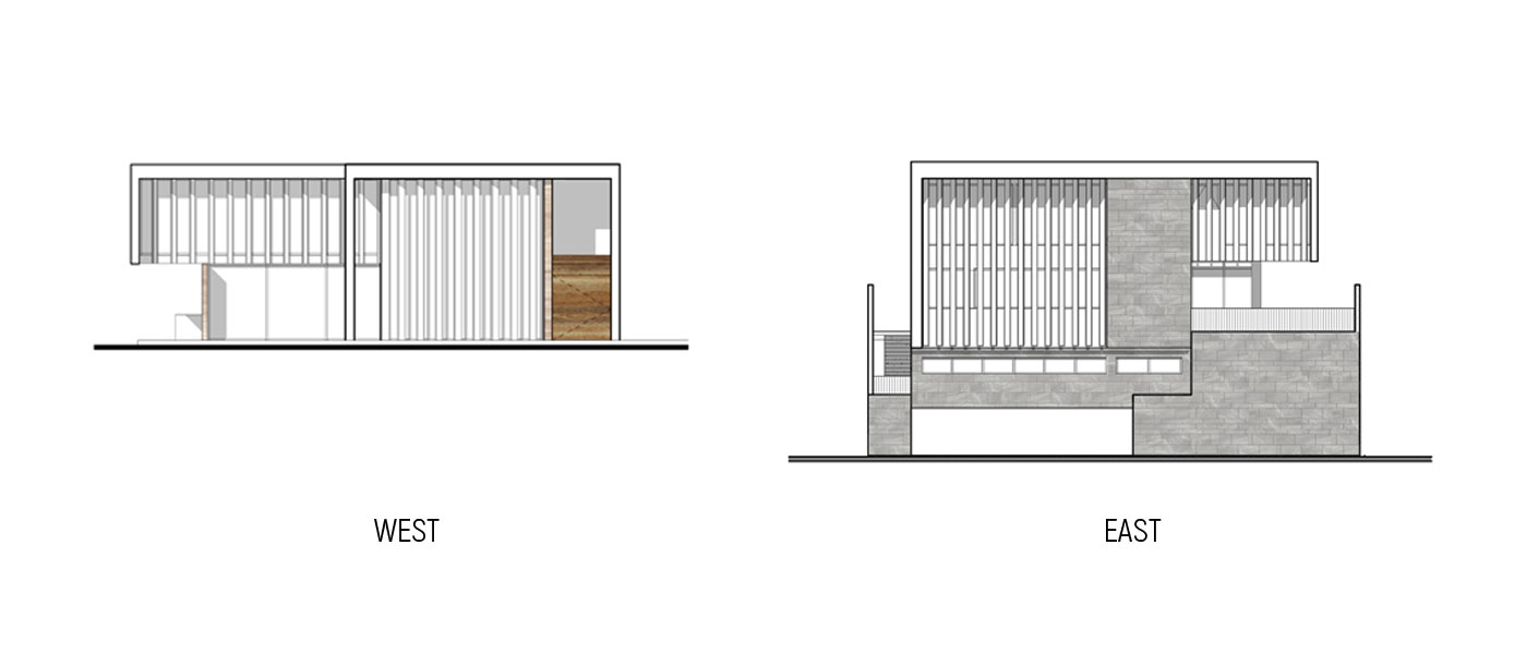
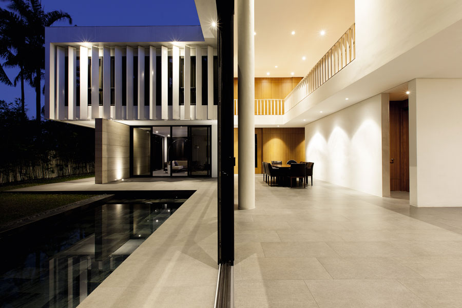
Located in a gated community carved from hilly terrain, the house stands on a rectangular through lot that slopes down from west to east. Taking advantage of the opportunities presented by the site, Tan-Branquinho organized the house on four levels to benefit from the dual frontage. On the western edge of the property, a gray stone-clad wall and a white fence fabricated from metal angle bars strengthen the relationship of the residence with the street, and define its public and private spaces.
Beyond these barriers, only the two topmost floors, those occupied by the family, are discernable. An L-shaped plan contains these floors and allows for a garden towards which most of the interior spaces orient, and from which light, air and nature are introduced into the building. The dual axes set by the plan also dictate flow and spatial layout. The architectural intent can be more fully appreciated at the eastern elevation where the full building height is revealed and the relationships of the different zones become readily discernable.
The entire structure is divided horizontally to articulate hierarchy and function. The spaces designated for the sole use of the family are contained within the upper half. The inscrutable whiteness of the main residence asserts the abstract purity of its form. As a counterpoint, gray stone tiles endow the service block beneath with a tangible and weighty physicality.
SpaceFabrik is making a name for itself for innovative designs of recreational buildings and leisure complexes, as well as conceptual architecture. Tan-Branquinho trained at the Dessau Institute of Architecture am Bauhaus, Germany, and at Foster and Partners in London; therefore her pursuit of a Modernist ideal comes as no surprise. For her firm’s first fully detached house, the architect put a great deal of thought into how the services and utilities were to be delivered. A pitched roof hides behind a parapet to maintain purity of form. No guttering or downspouts are visible; no mess allowed to muddle the aesthetic clarity that she was after.
READ MORE: Old to Bold: LIMA Architecture Renovates An Aging Villa
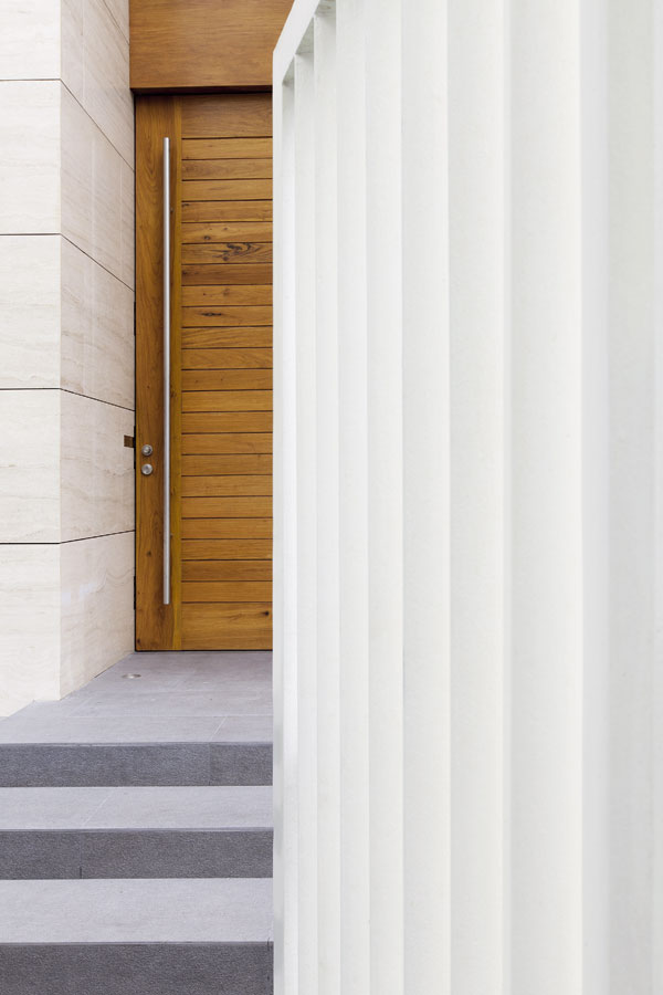
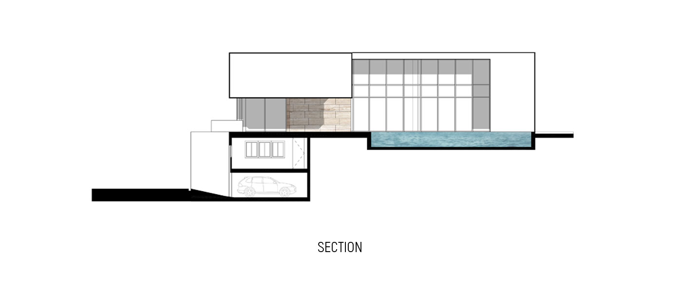
The main entrance is approached from the west. The sense of welcome usually offered in other homes via a sheltering overhang is deferred until after ingress. Instead, a travertine-clad wall that steps forth and slips past the tall and broad timber pivoted door ushers one in. Upon entry, a volume cantilevered above the foyer compresses vertical space to create a feeling of hospitable shelter. This sense of confinement is fleeting, however, as in the span of a few steps, space dramatically expands upward and outward into airy effulgence. An expansive double height space is the central area in the house towards which most rooms on both levels relate. A glass wall comprised of sliding doors below and windows above runs the full length of the space along its northern edge adjacent to the garden and pool. This allows the outside in, establishing a degree of intimacy with the natural surroundings, where the notion of greenery, water, sun and sky are omnipresent. The transition between the outdoor and interior spatial experiences is graceful and easy.
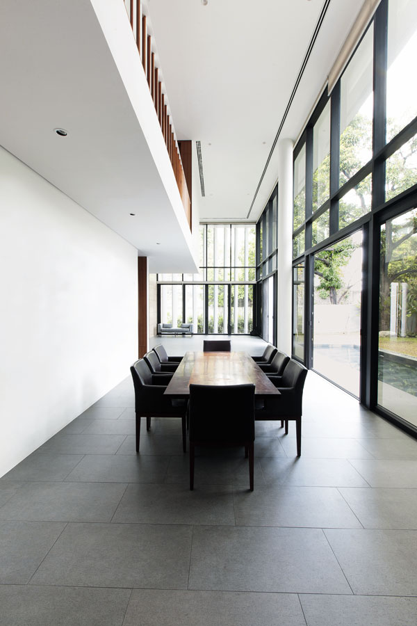
The design of the space makes it seem much larger than its actual area as one’s vision extends beyond the confines of the architecture. The vertical thrust at the heart of this open plan creates a dramatic contrast to the predominantly horizontal emphasis of the rooms beyond.
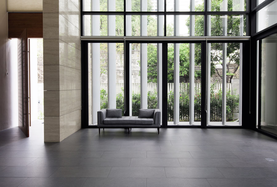
One of the ways SpaceFabrik designed for the prime concerns of their clients while addressing the realities of the site was by the use of brise soleil. These sun baffles protect the glass surfaces from direct sunlight, shade the interiors from glare, as well as secure privacy for the occupants without cutting them off from the views offered by the setting. Further, the vertical blinds crafted from lightweight aluminum panels provide surface relief from the rectilinear purity of the volumetric composition. Temporal rhythms likewise come into play as shadowy parallels mark the passing of time across interior surfaces. Opposing ideas such as opacity and permeability, revelation and concealment are successfully reconciled by means of simple devices that the architect feels are woefully underused in an environment for which they were specifically devised.
The twin tectonic elements of travertine-clad walls emphasize the prime axis of the building. These, in conjunction with the brise soleil, form thematic assemblages that bookend narrative routes through the house that begin at the front door and culminate at the rear in either the den or the masters’ bedroom directly above.
When architecture is this pared down, the bare essentials of design come into sharpest focus. When ornamentation is absent and articulation is kept to a minimum, human relationship with space and the elements that define it must be reinstated by other means. The consideration of scale, for instance, demands clever and sensitive handling when inherently descriptive elements such as steps and doorways are abstracted, hidden, or altogether nonexistent. SpaceFabrik succeeds resoundingly in meeting this challenge. At no instance does the double-height room feel awkward in its dimensions or the relationship it establishes with the rest of the house.
Every door stretches to the ceiling yet instead of a feeling of vertical exaggeration, the impression is that of walls sliding apart to permit passage, thus emphasizing familiar width. Scalar clues like this are given at a degree so subtle as to be largely perceived subconsciously. The discipline and finesse this aesthetic exacts can be unforgiving but the architect pulls it off.
The play of volumes is something one rarely sees in local residential architecture.
– Stephanie Tan-Branquinho
The dual axes of the house plan set perpendicular to each other account for the highly pleasing spatial transitions from one space into another. These transitions from public to private and communal to personal are resolved by the subtle use of turns. Where floor finishes are consistent throughout each level and not so much as a threshold denotes the start of one space and the end of another, changes in direction, in increments of 90 degree angles, take on vital importance. Each turn works to prepare one for the experience of a new space. It is this that affords one the discovery of varied spatial experiences and views. Progression is handled masterfully throughout the house and is one of the keys to its pleasurable understanding.
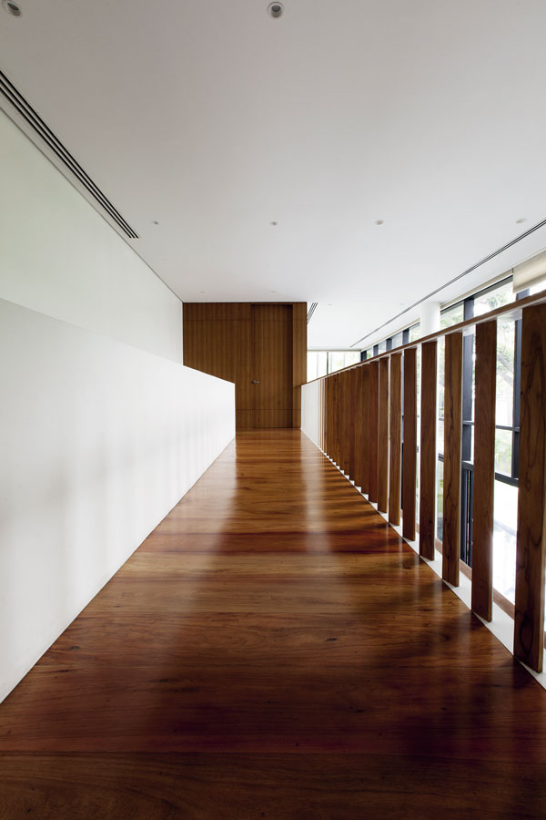
Upstairs, the airiness of the tall living space and the relationship with the outside continues unimpeded. Ample storage is provided along the hall that connects the upstairs bedrooms. The quarters for the children are designed identically, each with its own bathroom. Every room is well appointed but not too self-contained so as to encourage gathering as a family in the communal areas downstairs.
The upstairs hall continues into the master bedroom with enough distance to create ample width for an en suite bathroom. Quiet retreat for the homeowners is facilitated by another turn. The room cantilevers 2.5 meters to the north, asserting its primacy within the composition. At the east, views toward the distant mountains and the mellow light of morning may be savored. The west end of the space overlooks the garden, pool and street beyond. The judicious use of brise soleil satisfies the clients’ preference not to be seen from without, yet to be able to watch over the children in the outdoor play areas.
An apartment for the household staff is located beneath the main residence floor. This self-contained unit is thoughtfully furnished with a dormitory, bathrooms, service kitchen, laundry, lockers and further storage areas. This block is accessed by a flight of stairs separate and offset from that of the house above. A door separates these two distinct areas and provides an added layer of security and privacy for the owners.
The placement of the garage at the low end of the slope does away with the back-of-house clutter that often plagues houses with frontal vehicle sheds. To one side of this open space is a self-contained flat for a driver.
The house has been lived in by the family for over a few months and has even withstood a powerful typhoon, which hardly made its presence felt indoors. It continues to provide tranquil comfort as the summer swelters.
In the pursuit of crafting a dream home for a family, Stephanie Tan-Branquinho and SpaceFabrik utilized modernist principles to respond appropriately to context and user needs. Far from imposing modernism as stylistic costuming for a building, the architect acknowledges modernism as a way of life that has everything to do with delight, comfort, functionality and quality of living. It is a fine modernist structure that takes advantage of light, space, and nature to enhance the experience of the inhabitants. This sun-baffled residence is as pleasurably accommodating as it is thoroughly thought through. ![]()
![]()