BAAD to Basics: building the comfortable Opposite House
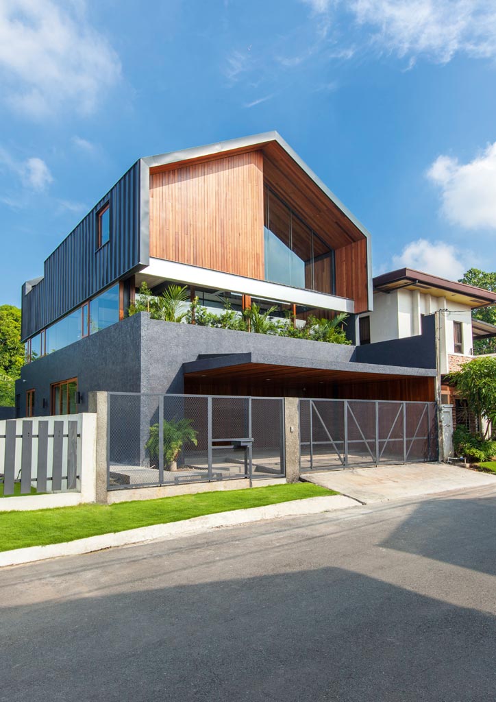
Ask any child to draw you a house, and you get a square with a triangle on top. It’s the most basic form for shelter one can think of, yet nowadays, it’s surprising to see a house actually built in that shape, as BAAD Studio did for the Opposite House. “It’s everyone’s first idea of what a house is. It’s a silhouette kids are familiar with,” says Benjee Mendoza, who runs the firm with co-principal An Bermejo.
The form of the Opposite House wasn’t born from the architects tapping their inner child, but grew organically from the clients’ lifestyle and requirements. The brief of the clients—a husband and wife who, ironically, have no children—was for Mendoza and Bermejo to design a house totally in contrast to their previous one in aesthetic and space allocation. The old house was a white two-storey structure with lots of glazing on the façade, topped by a flat roof deck for parties. Its outdoor space had a lawn and pool area.
The catch was, the new lot would be 200 square meters, half the 400 their old house occupied. The clients wanted to “downsize” yet maximize the space, citing how they rarely used the high-maintenance lawn and pool. They were specific about the allocation of spaces, preferring a three-storey structure with the living spaces on the top floors. Another issue they wanted addressed was heat gain—the copious amounts of glass but no outlets for hot air in their old house led to massive heat buildup in the interiors.
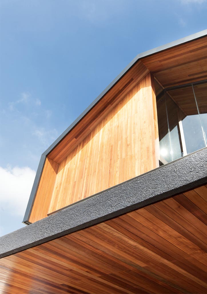
Unhappy that a three-storey structure in a small lot would resemble a tower, Mendoza and Bermejo’s design “hides” the exact number of floors to passerby. The familiar silhouette of a house with a pitched roof was drawn up, and the exterior painted black in opposition to the old house. The middle of the structure was then “sliced off” with glazing. The “slice” in the middle prevents the house from looking like a towering black mass, and even obscures the actual number of floors from the casual observer outside. “We love the simplicity and unpredictability of the exterior—it’s a familiar shape, but then it’s all black,” says Mendoza.
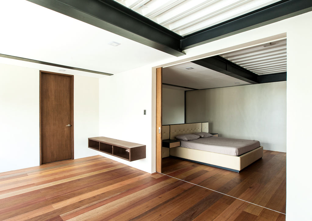
While the form is simple, the layout of spaces inside is unconventional. Since the clients have no children, they wanted to play around with the program of spaces to suit their carefree lifestyle. “They had many ideas about the program during construction, but their main request was for the living areas to be on the upper levels. They wanted to maintain their privacy and keep visitors downstairs. Guests would be welcome upstairs only when they’re throwing a get-together,” says Bermejo. The partners foresaw the hassle of preparing food in the ground floor kitchen and bringing it up, but the clients insisted on the setup.
Guests are led to an anteroom upon entering the house, which the husband plans to turn into his personal café complete with tables, chairs, and a bar.
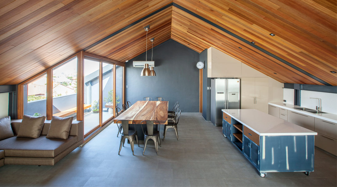
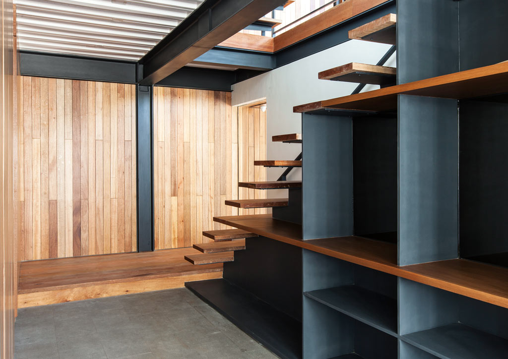
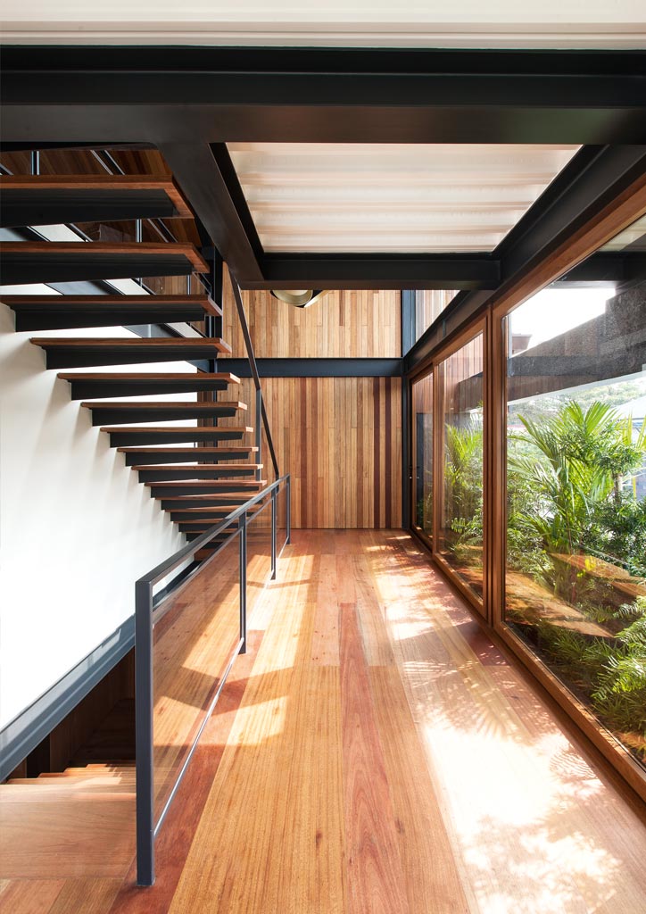
To the right is a hallway that leads to two kitchens, and the staircase leading to the upper floors. On the second floor is a 90-square meter room divided in two—a master bedroom, and a lounge with dining space. Sliding doors along the second-floor landing, which make up the slice in the exterior, open up views of the street outside. The topmost level, right under the roof, is dedicated to the living room and another kitchen where the clients may entertain guests or simply relax in.
Different textures were used for the exterior, such as wood and concrete for the façade and galvanized steel for the roof. Glazing was not done away with entirely but judiciously positioned for natural lighting, while avoiding heat again. Facing southeast, the house is properly shielded from the brutal afternoon sun. The left portion of the façade is clad with guijo wood to protect the upper floors from sunlight coming from the southeast, but the right side is faced with glass to open up views and allow sunlight to brighten the interiors. The back of the house, facing northwest, is completely closed off to prevent the afternoon sun from heating the interiors like an oven.
While the Opposite House’s orientation is favorable, some design elements could potentially increase its heat gain. Black absorbs the most heat, and the use of corrugated metal sheets for the roof could warm the third floor. However, the house is almost devoid of stagnant hot air, thanks to BAAD Studio’s correct application of cross-ventilation and passive cooling. Mendoza and Bermejo thoroughly analyzed the site to determine the sources of air flow and found that funneling the southeastern wind through the second floor and releasing it through the back end of the third floor would be ideal. The slice in the middle of the façade is no gimmick but is functional, as light breezes pass through the sliding doors and cool the second-floor landing. Furthermore, the 7-square meter balcony protruding from this slice is intended to host vegetation to filter the air coming in.
The Opposite House’s basic form and comfortable spaces affirm the efficacy of BAAD Studio’s user-centric approach. Clearly, BAAD did good once again. And when BAAD is good, they’re very, very good. ![]()
![]()
This article first appeared in BluPrint Vol 4 2016. Edits were made for BluPrint online.
Photographed by Ed Simon
READ MORE: BAAD Studio designs a house that really, really breathes
