Chung and Gan’s Caliraya House is simple but not plain
From the street, one catches a glimpse of the warm wood interior through glass, and of the angled roofs that slope upward on opposite sides as if poised for flight. The Caliraya house was designed by FY Chung WMC Gan Co, Inc., composed of architect William Gan, head of design research Fredric Chung, and their design team. Gan, Chung and their partners are in the business of designing and building “urban homes,” for lease or sale. “We design houses in the heart of the city, which give its inhabitants a sense of space, light, quality of materials, and a thoughtfulness that is sometimes hard to find in dense urban areas,” explains Chung. This one is located in a gated community south of Metro Manila, but maximizes light, space, and quality of material all the same.
Honest Materials
Chung, an admirer of Modernist maestros Louis Kahn and Mies van der Rohe, says the latter “was trying to get at the truth of architecture—simplify, simplify, simplify.” This influence is very much present in the language of the Caliraya house—clean lines and streamlined forms free of ornamentation, and an emphasis on simplicity and a creative use of material.
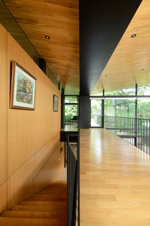
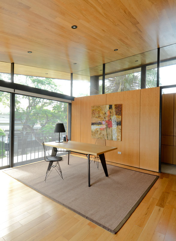
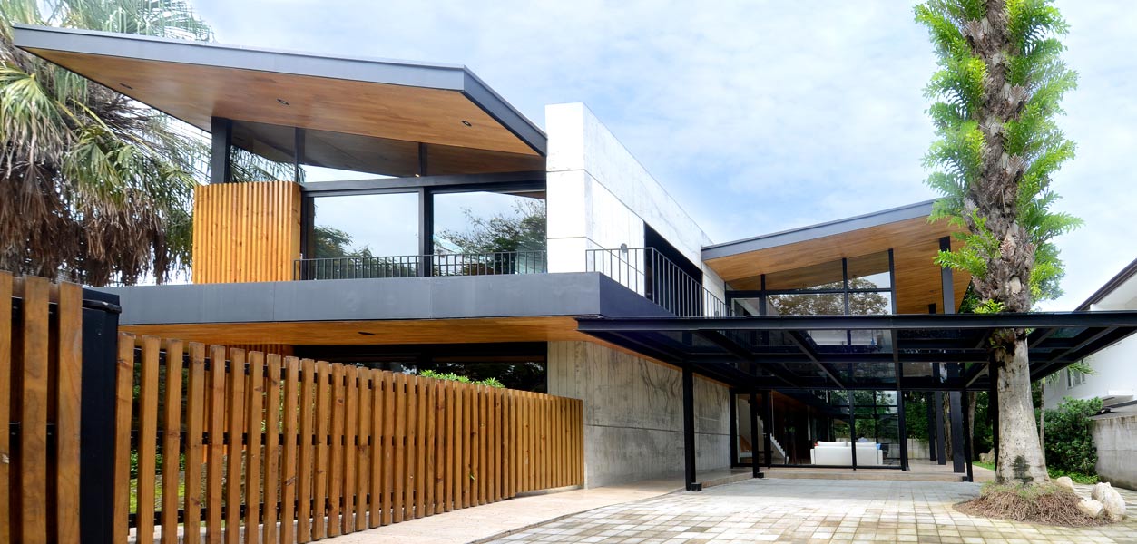
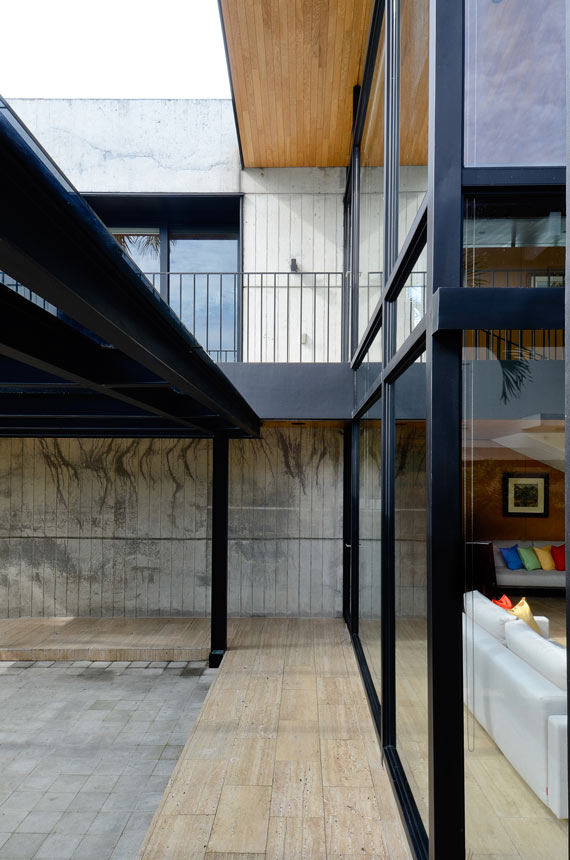
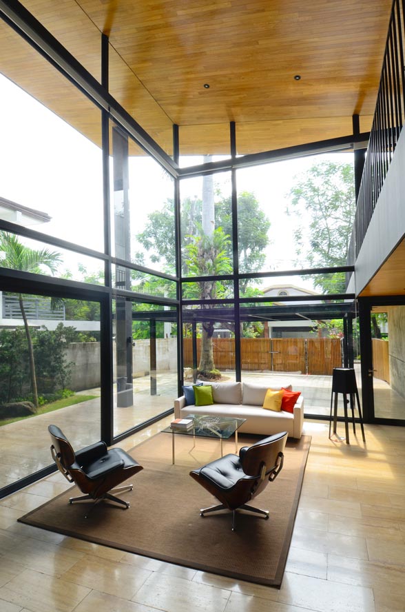
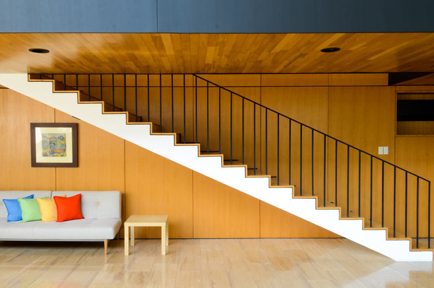
The “spine” of the house is a robust wall of rough, unfinished concrete, juxtaposed against lighter and finer materials—wood, metal and glass. “By putting them next to each other, they let each other shine. You feel the weight of the concrete, the warmth of the wood and the lightness of the metal,” says Chung. The interiors are clad in oak wood panels in their natural, light finish. For the floors, they chose travertine, “a noble material with a long history; it’s what the Romans used to clad the Coliseum, and their temples,” says Chung. “It ages nicely. It’s durable, and has a lot of character.”
Chung and his partners strived to design a house with minimal wastage and optimum use of space. “Materials come in standard sizes, and we tried our best to dimension the house to use whole panels for the glass and wood—divisible in 30-centimeter chunks—so we have very little wastage. That also makes the house modular and well-proportioned,” he says.
READ MORE: Villa Marina: The WAF-approved Neo-Bahay na Bato
Sense of Space
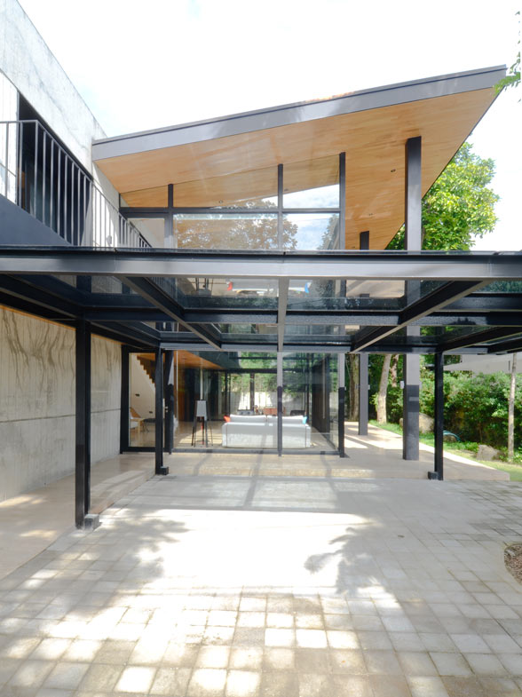
The program is clear and simple: divide the house into two blocks, the public (north) and private (south), then anchor the center (east-west axis) spine with poured concrete. Large sliding doors serve as glass walls that wrap around three sides of the public wing, which contains the double-height living and dining spaces. “Your space, visually, is four to five times the size of the space that you’re in,” says Chung. “We wanted to maximize the sense of openness, the expansiveness, the space and the light. So the reading of space visually continues outward.” Even on days when the glass sliding doors are shut and the air-conditioning is switched on, the living/dining room flows almost seamlessly outward to the greens and pool outside, and vice versa.
The orientation of the house dictated the decision to use glass on the north side of the house. 1.2 to 1.5 meter wide eaves shield the home from the elements. Tempered glass walls and sliding doors enclose the double-height public wing, which only gets direct sunlight very early and very late in the day. The glass sliding doors can be drawn open to allow for cross-ventilation through the screens, while trees at the back of the house shade the rooms on the west side from the hot afternoon sun.
Chung describes the voluminous, open plan living and dining space as “the heart of the house.” From here, the doors leading to all the other rooms in the house are visible. He says, “There is privacy in each room, but when you come out of the room, you walk up and down the hall, up and down the stairs, and from one room to another, you can’t help but notice each other.” The idea was to create a flexible mix of public and private spaces, and to create room and opportunity for interaction.
Letting Light In
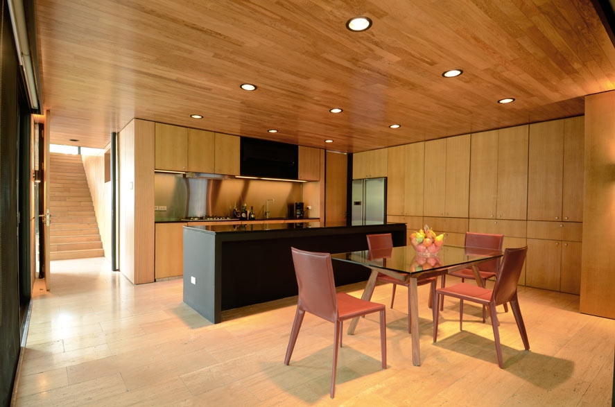
The master bedroom and kitchen on the first storey and four rooms (including a junior master bedroom) on the second storey comprise the private wing of the house. The master bedroom on the first storey is bounded by floor-to-ceiling glass sliding doors on two sides. In each room, the goal is to draw as much light into a compact space. Blinds can be drawn for privacy, but the intent to blur the line between indoors and outdoors and create a space that “expands outwards into the garden” is maintained.
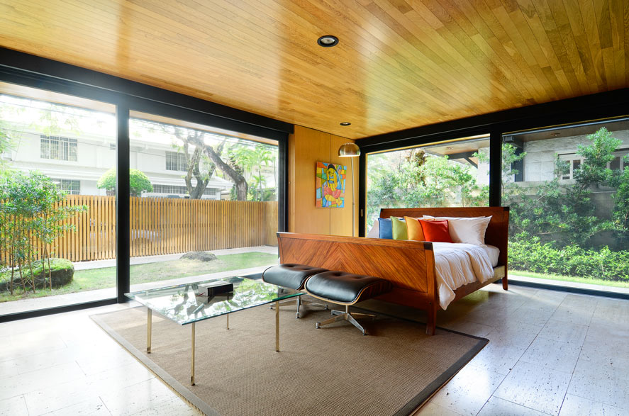
Chung says, “We wanted to explore the possibilities of sloped roofs and the use of clerestory windows to make space explode outwards without actually increasing floor area—trying to expand the space visually, to bring in more light.” The sloped roof allowed clerestory windows to wrap around the entire private half of the house, so that each room has a view of the sky, even when the blinds are drawn. A continuous sense of space is achieved throughout the house, because despite the privacy of the rooms, light floods through their clerestory windows. Like the light-filled public wing, the private spaces are bathed in natural light, compact yet voluminous. Each room feels much more spacious than its actual footprint. “It’s expansive yet compartmentalized space. It’s both at the same time,” says Chung.
READ MORE: Lessons on small design from WOHA (and Nick Joaquin)
Functionality and simplicity reign throughout the house, each design choice and detail purposeful. The result of thoughtful planning and careful consideration of material, light and space, the Caliraya House is all set to become a home. ![]()
![]()