Exclusive: A Look Inside Aesop’s Bahay Kubo Concept Store
The luxury boutique distinctively introduces a minimalist representation of the familiar symbol. In this exclusive interview with Marianne Lardilleux, Aesop’s Head of Store Design, BluPrint talks about the integration of Filipinism into Aesop’s new store at Rockwell, Power Plant Mall Makati City.
BP: Out of all the elements of the Bahay Kubo that inspired the store design, what do you think aligns most with Aesop? How did you translate this into the look and feel of the Rockwell branch?
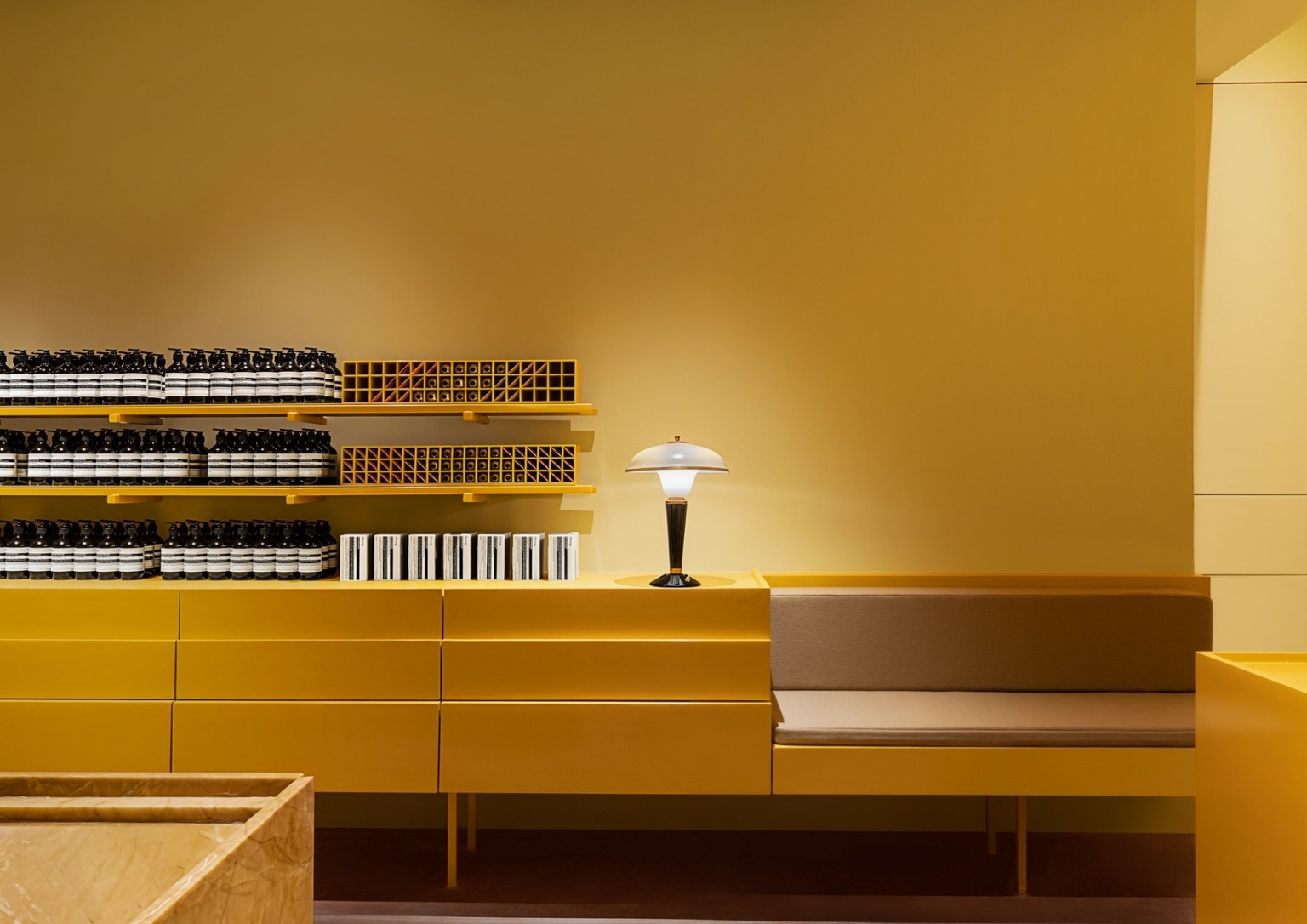
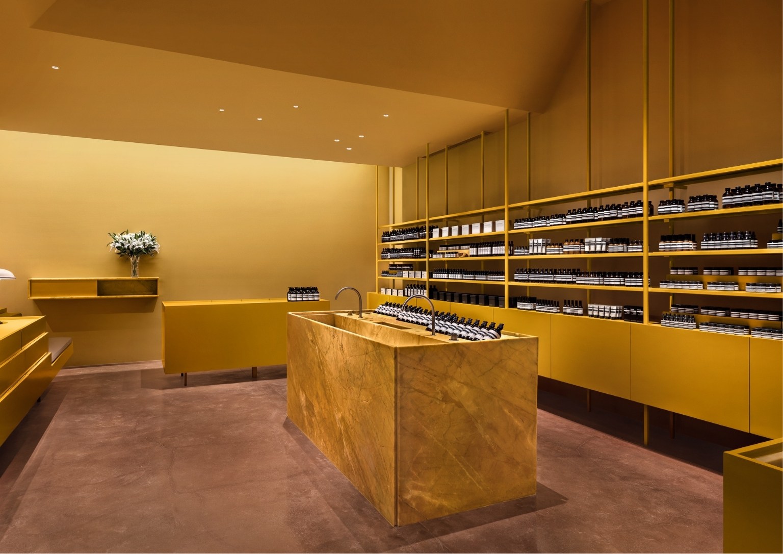
Marianne Lardilleux: Aesop Rockwell echoes the familiar vernacular of the Bahay Kubo’s pragmatic yet inspiring forms – high-volume organic roofs, horizontal woven cladding, and repetitious stilt footings – turning these architectural characteristics into domestic qualities. Variations of ceiling heights form a hierarchy of experiences; intimate and nurturing interactions with seating and sinks arrive at moments of compression, and expansive displays of the brand’s product offerings unveil in tandem with the pitched bubong-ceilings.
BP: What experiences or moods did you want to highlight through the layout and design of Aesop Rockwell?
Marianne Lardilleux: In Aesop Rockwell we want our customers to feel welcome and to test our products in an intimate and warm atmosphere where all the senses are alerted: a pause inside the noisy mall and the clutter they are exposed to every day.
BP: What do you consider to be the centerspace of the space and its design? What makes it special?
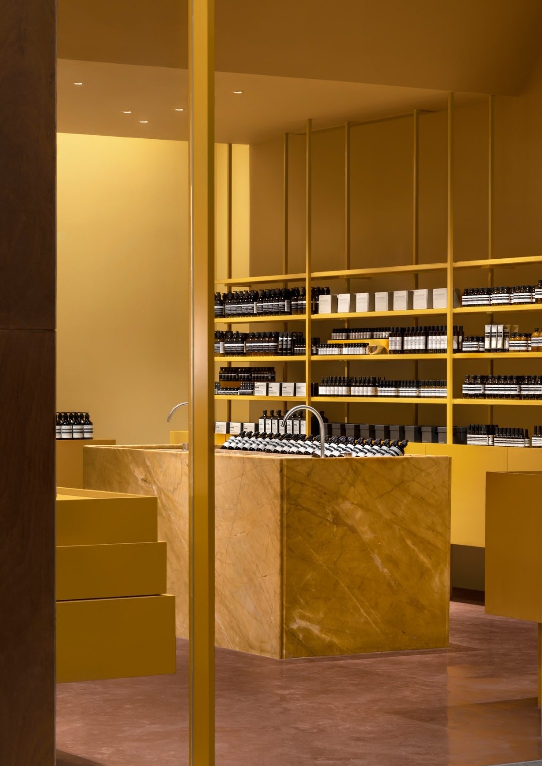
Marianne Lardilleux: The center space of Aesop Rockwell is the large rectangle marble sink located in the middle of our store. There is special attention to the sink in every Aesop space where the consultants can guide and ‘immerge” each customer through various Aesop products and the fantastic sensation they give.

BP: What materials did you handpick for the design? In what way do you think they reflect the qualities of Filipino culture that served as inspiration for the project?
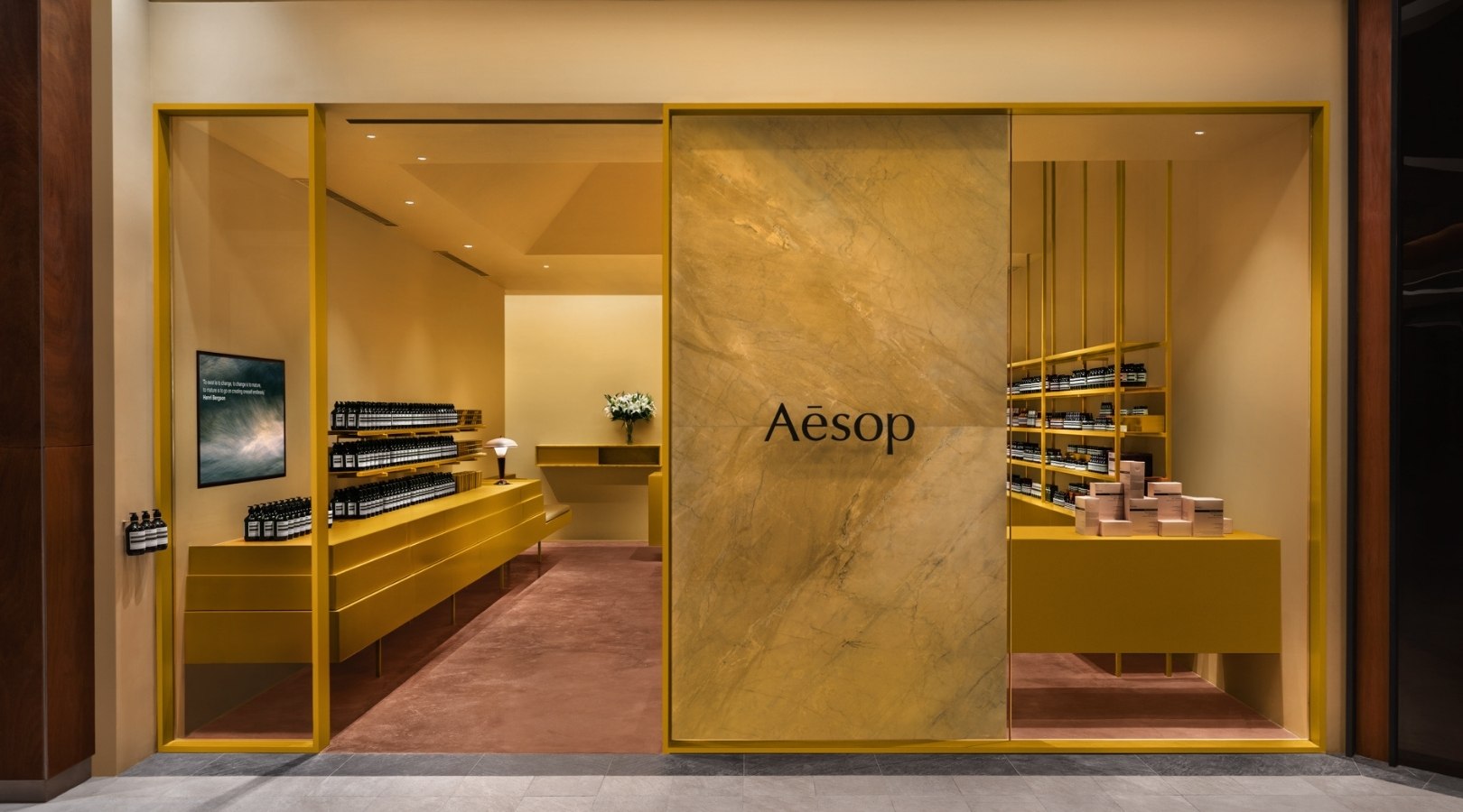
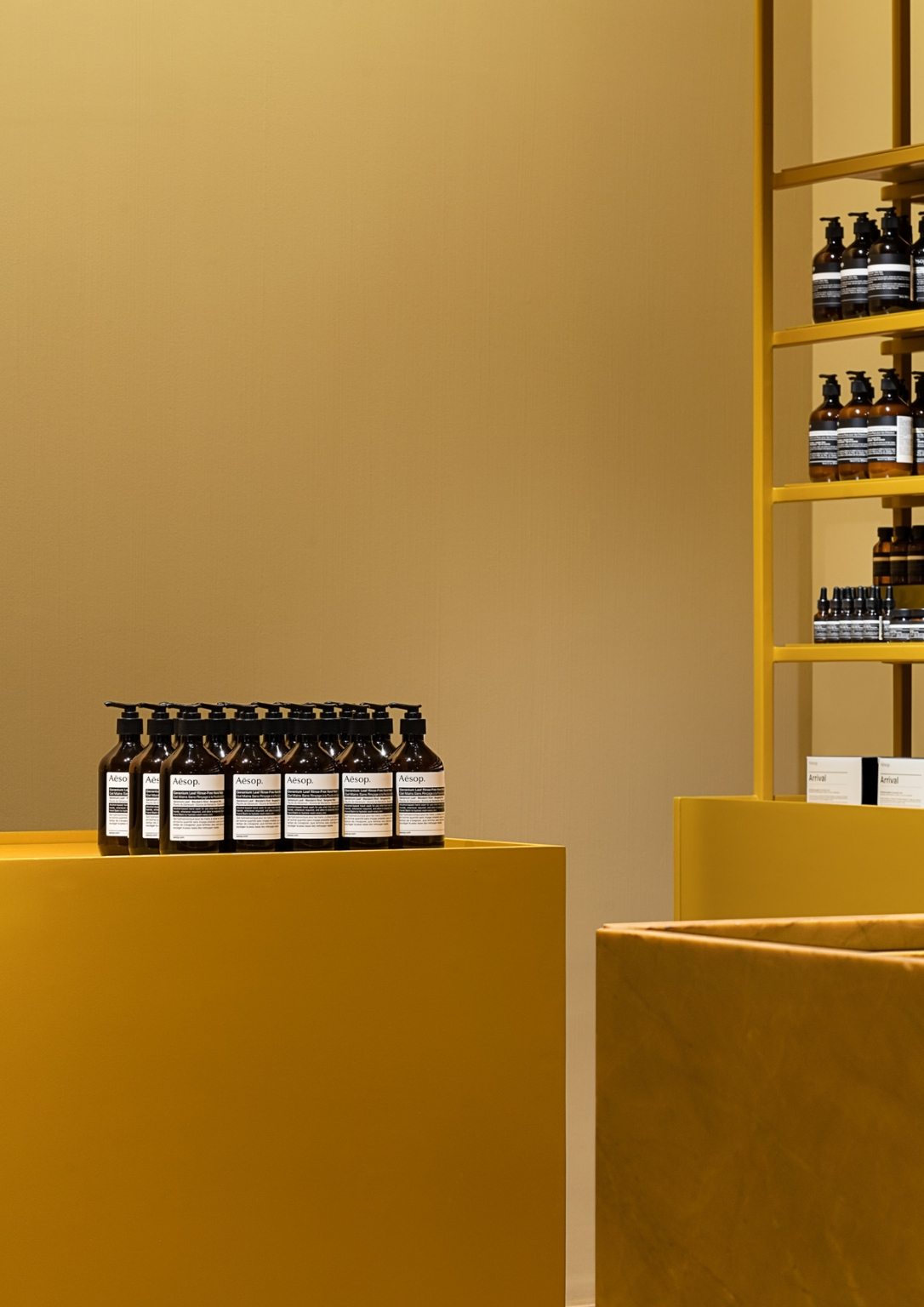
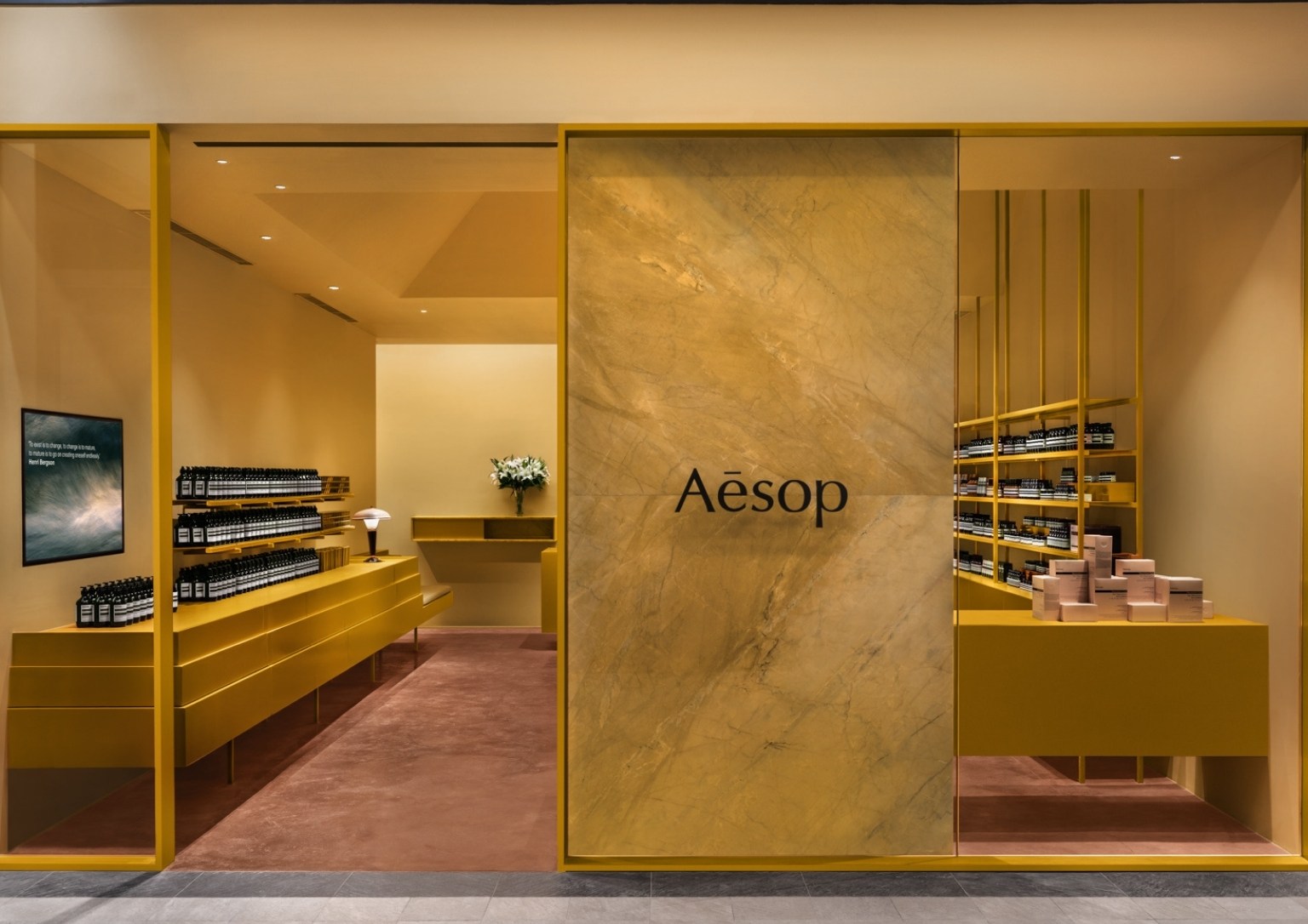
Marianne Lardilleux: The color palette is inspired by the golden, deep orange, and earthy tones made familiar by sunsets over Manila and Manila Bay. These tonal and textural odes to the Philippines are intertwined through natural pigmentations of honed stone and glossed powder-coated finishes of orange and gold. The vertical brush expression on walls and ceiling treatment remind the textures of the nipa palm leaves traditionally found forming the boundaries of the Bahay Kubo.
BP: How did you envision the store to be a place of brand engagement with Aesop customers?
Marianne Lardilleux: The Aesop experience at Rockwell starts with the facade – a threshold of transparency and the opaque that establishes an initial engagement of curiosity.
In this respectful reimagining, clients can explore and select from a complete range of skin, hair and body care products, distinguished by botanical and laboratory-generated ingredients of the highest quality. The store’s trained consultants are able to offer advice about products best suited to individual needs.
Aesop was founded in Melbourne in 1987 and today offers its superlative formulations in signature stores around the world. As the company evolves, meticulously considered design remains paramount to the creation of each space.
Photos Courtesy of Aesop Philippines.
