Unlike its predecessor, Gen Z Yellow is less than specific—if not totally unspecific. Its range is so wide that one can use it in any décor, furniture, and space in his or her abode. It can be the lightest muted hue or the brightest neon shade. And while this flexibility and versatility allows infinite possibilities in interior design, there are certain, often unspoken, dos and don’ts one must know if he or she wishes to join the craze.
Dos
DO: Give Hints
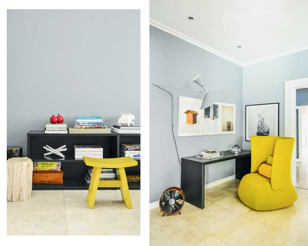
If you don’t want to seem like you’re trying too hard, you can incorporate Gen Z Yellow as an accent color. Have it in smaller proportions like a stool in the living room or your workspace, the outline of your doors or windows, and other accessories. This allows you to be trendy in a more subtle way. 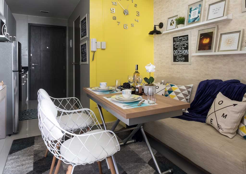
DO: Make a Statement
For any space in your condo, choose one or two large statement pieces in a Gen Z Yellow hue that matches your design philosophy. This can be a velvet chesterfield sofa or a huge art piece on your neutral-colored or muted walls. If you’re bolder than this, you can paint your walls to vivify your pale-colored living room set.
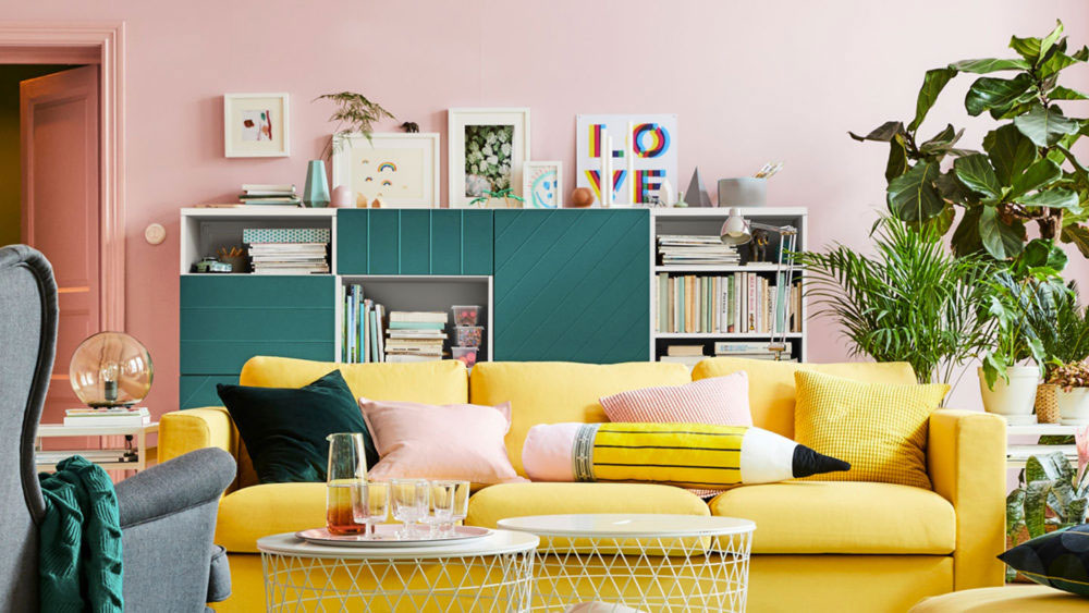
Do: Go All-Out.
Whether it’s a specific room or your whole condo, you are free to go all-out Gen Z Yellow as long as you can commit to it.
Don’ts
DON’T: Forget Complementary Colors
Yellow can be eww when paired with the wrong color. Check your color wheel and then to keep yourself from committing a crime. Some of the usual formulas include:
yellow + gray
yellow + pink + cream
yellow + brown
yellow + red
yellow + black + white
yellow + green
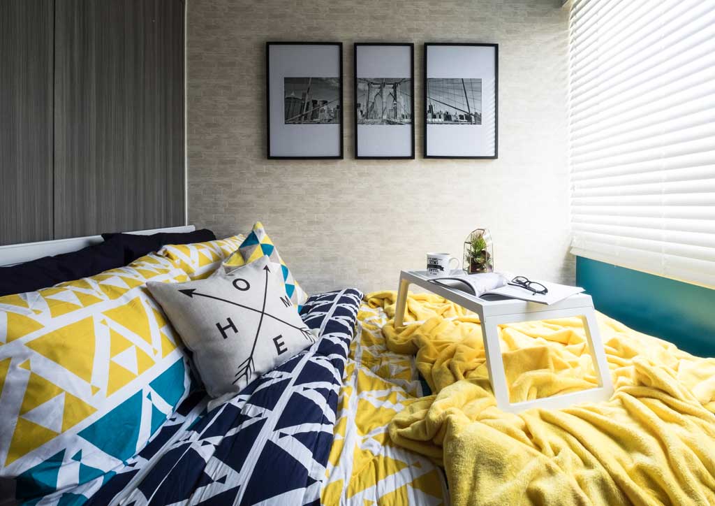
DON’T: Be Afraid of Yellow-on-Yellow
Sure, it seems unhealthy for the eyes, but you can do this by using a lighter or more muted hue against a bolder and richer one. You can also play with textures and patterns in Gen Z Yellow.
DON’T: Go Overboard
While we encourage you to experiment with Gen Z Yellow, we can’t let you go astray. Be more critical when deciding which pieces to put together, especially when they’re in similar and almost identical hues. If you’re doing one space in full yellow, allow accents in different but complementary colors. Photo courtesy of IKEA
