This stunning home renovation proves that practical can be stylish
Home renovations can be tedious, but this transformation shows that style can go hand in hand with practicality
“Most people have this notion that home renovations are easier compared to building from the ground up. However, it’s not like that in reality. In all my years of professional practice, I’ve seen renovations that were quite challenging. I can say that this is probably one of them,” begins interior designer Carol Peña. The owner of this townhouse enlisted her services to transform his three-level dwelling.Carol wanted change to start from the outside. She retained the color and shell of the structure but added modern touches to enhance the facade. “We decided to take out the arched window and replace it with a rectilinear one. It wasn’t particularly easy as we had to break some of the concrete to make way for it, but the results were worth it. It makes the townhouse feel updated, and breaks away from the rest of the townhouses in the compound in a good way,” she explains.
The doorsteps from the original blueprint remain, but the high-ceilinged porch and arched doorway were given a proper facelift. A massive pewter-colored door with a metal handle running from top to bottom replaced the carved wooden door with its old brass handles.
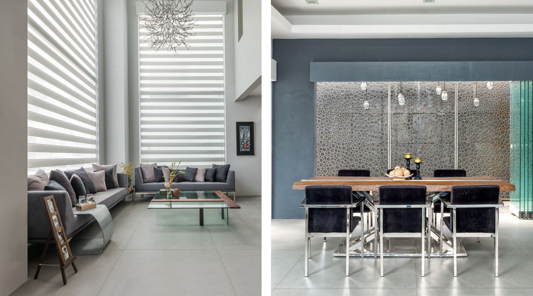
Guests are treated to a playful display of volume upon entering the townhouse. The living area to the left is bathed in natural light coming from the picture windows. Carol replaced the old parquet flooring with large ceramic tiles. A pair of custom made sofas were upholstered in a darker gray shade to anchor the space. The low slung center table calls attention with its mix of glass and wood ties.
“The table is from Tacloban Prevails and was designed by Bernardo Ubina. The wood slates that he used for this piece were from the Yolanda aftermath. I mix a lot of local artisans’ creations with established designers, especially those who know how to up-cycle. This way we help small players thrive and at the same time promote sustainability in our projects,” she narrates.
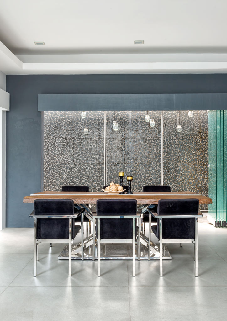
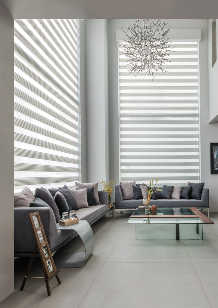
Carol painted the walls in different shades of gray for the home renovation. The colors are echoed in the throw pillows on the sofa to render a play of light and shadow. The dining area is located adjacent to the living space in a simple open layout. The molave and steel setting seats eight comfortably.
The original layout was similar but the dining area was surrounded by walls that made it feel cramped. “There were a lot of options to open up the space but we decided to use glass accordions because they’re contemporary and perfect for the design we wanted,” she shares.
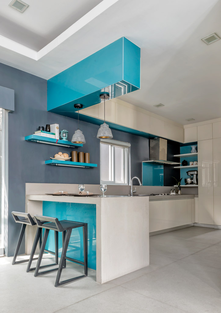
The first floor is spacious at around 180sqm, but Carol opened it up further. The kitchen formerly enclosed by walls and accessed through a doorway is now an integral part of the living spaces. “We opened it up and actually extended it a bit to make it even more spacious,” she adds. The area is sectioned off with a breakfast nook complete with geometric bar stools. Shelves and open storage increase the space’s functionality without sacrificing style.
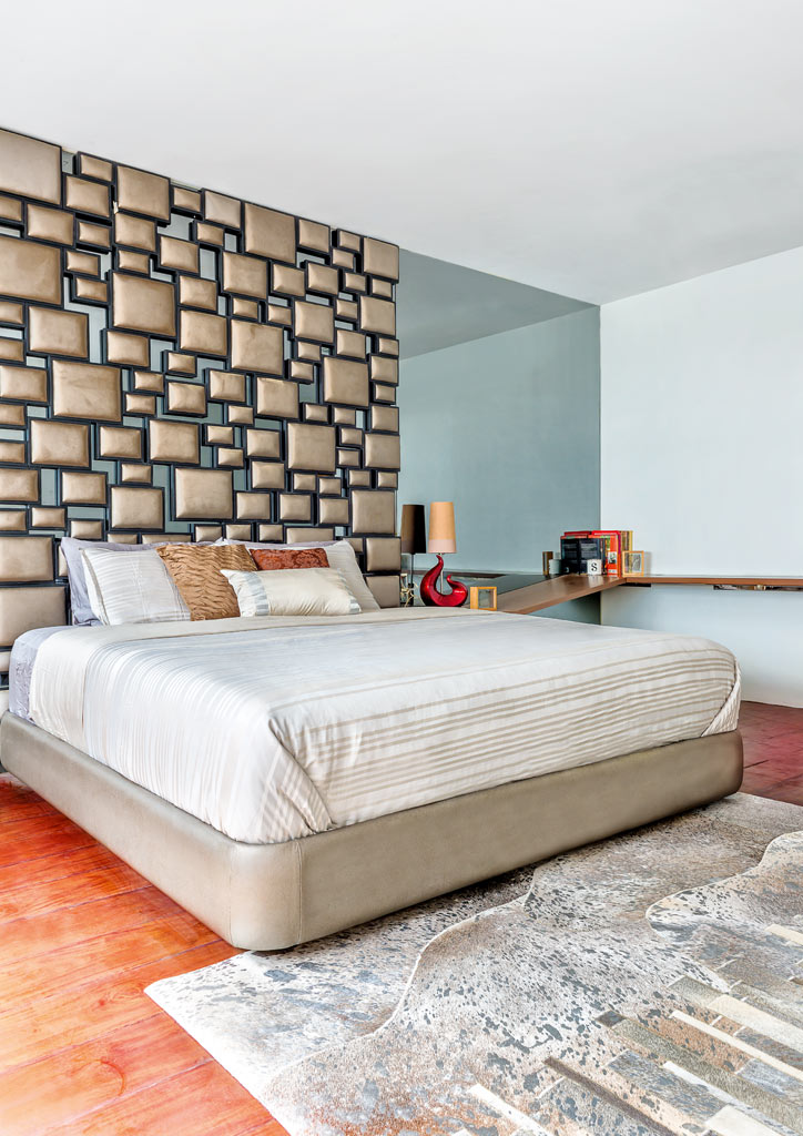
Parquet stairs leading to the private spaces on the second floor were replaced with molave slabs. Furthermore, the arched wrought iron balustrade was changed to tempered glass. To the left is the master bedroom made more sophisticated by smoked mirrors and soft tones. Grained leather squares of varying sizes adorn one wall and function as the headboard.
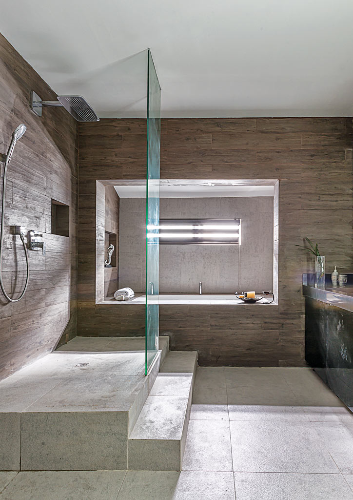
The old master bath was converted into a walk-in closet with ample storage. “It was rather small, so we extended it into the next room to make it more luxurious,” Carol explains. As it was a home renovation, a new master bath had to be created. “You’ll notice that the ceiling of the foyer is lower than that of the living are when you enter the house. However, they used to have the same ceiling height. We took out half the volume to make way for the bath,” she adds. The area is devoid of heavy ornamentation yet still feels grand with its stone and glass finishes.
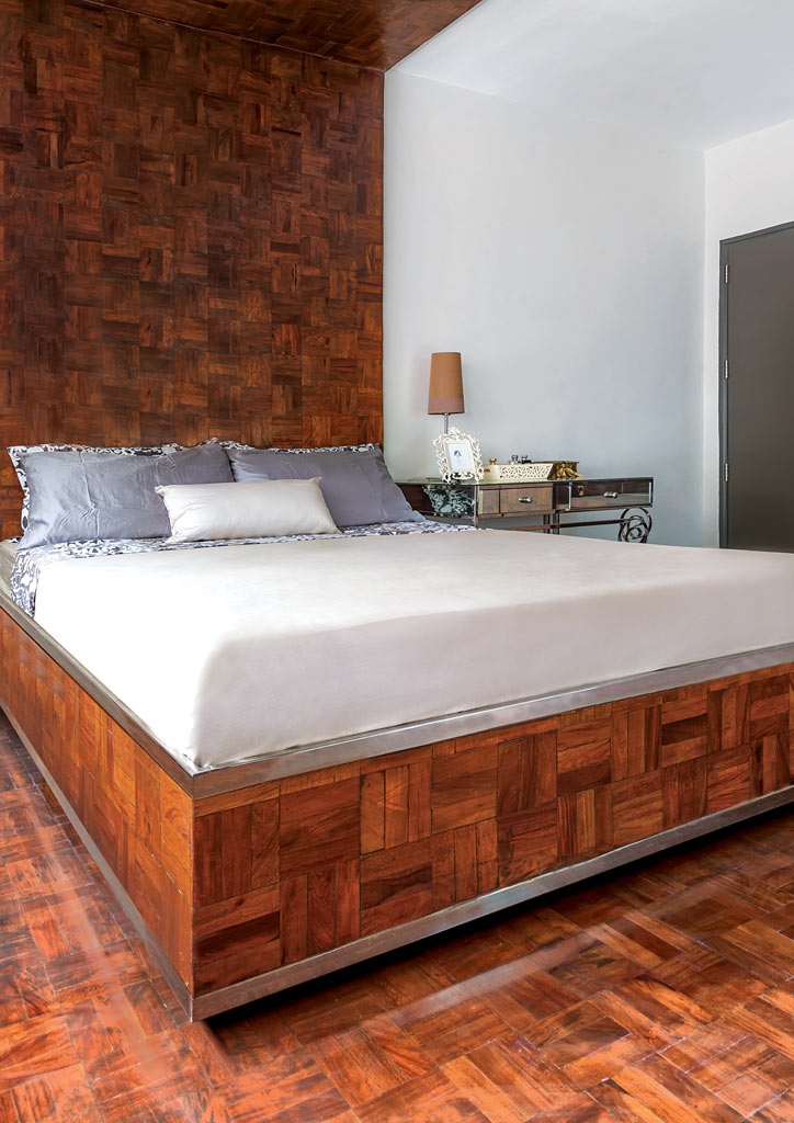
There are two more bedrooms on the second floor and one is done in the same color scheme as the rest of the house. The other bedroom showcases the designer’s ingenuity as it contains all the old parquet flooring from the original townhouse. “I couldn’t bear to throw them away so we decided to use everything we took out,” Carol continues.
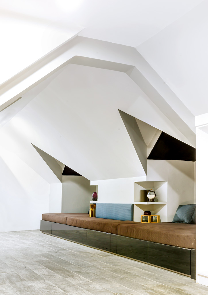
The third level houses the attic that the owner wanted for entertaining guests. “He likes having friends over so it was a must to have a provision for a bar. Moreover, additional space was necessary. We concealed it similar to how we did the service area by the kitchen. It’s actually located behind one of the panels that acts as a door,” Carol says.
“I always push for sustainability in my designs and home renovation projects. This one embodies my philosophy as a designer, and also what I strongly believe as a design educator,” the designer finishes.
