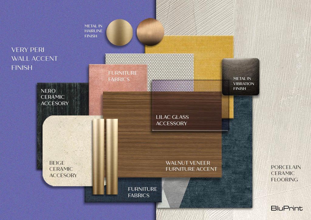
How to make Very Peri work in your home office
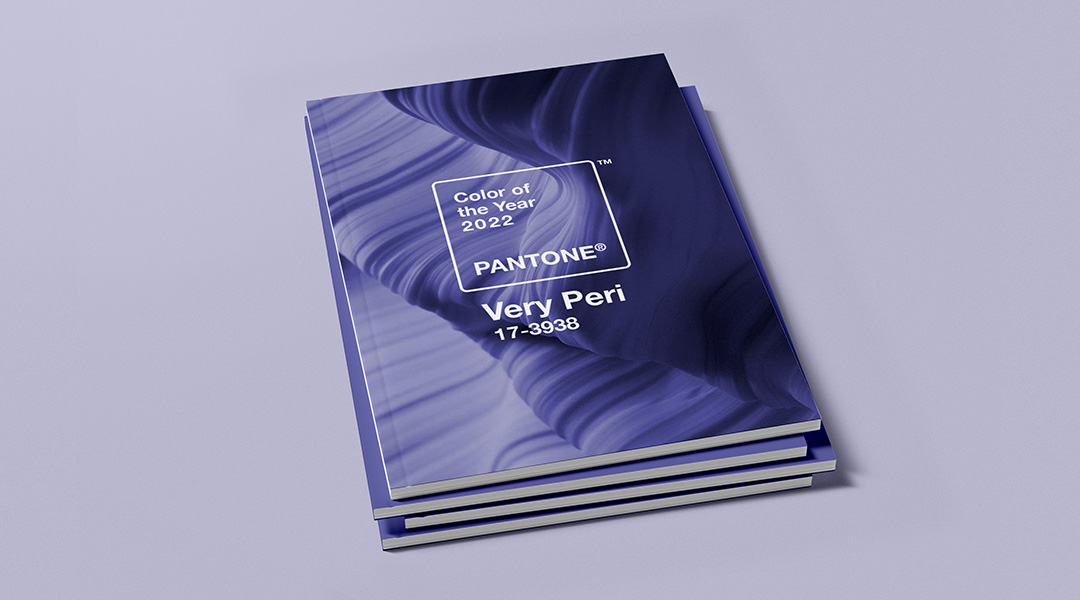
New year, new color. For 2022, it’s Very Peri, which Pantone designed to bring a courageous presence that emboldens us with “personal inventiveness and creativity.” It sounds just the kind of mindset that we can use to better navigate the transformative times we live in. This applies to our work life, which we continue to spend in our homes.
However, this daring and unconventional color can be challenging to bring to a work space. It’s not the first color to come to mind when we think of revamping an office. Likewise, we have to carefully think about how it blends with what we already have in the space. Still, with most of us working from home until the unforeseeable future, it never hurts to transform the work area into an inspiring and creative one.
“It’s very interesting and exciting to note that for 2022, Pantone manufactured this new color from scratch,” Cynthia Almario of Atelier Almario noted. “The color reflects the global innovation and transformation that is now taking place. It represents hope and possibilities.”
Very Peri belongs to the family of blue, which, according to Rossy Anne Rojales of Hurray Design, has a calming and gentle effect overall. “It’s a color attached to optimism, which is especially needed during these times. It’s a great color for your home office if used in the right amount of application.”
Bringing Very Peri to the home office can be as simple or as complex as one likes. These tips and tricks from the country’s top interior designers will help you make the best choices for enlivening the space.


Get the color professionally mixed in paint stores.
For Ivy Almario, the biggest challenge to using Very Peri is getting the color mix right. “It has hints of blue and purple, yet it’s not a lavender,” she noted. “Periwinkle, to me, needs to read as soft as a pastel color without going over the top. It cannot be saccharine.”
If you’re thinking of repainting your space, her suggestion is to have the color professionally mixed in paint stores. A color swatch or color guide will allow you to get the exact Pantone shade, and provide you with other options should you wish to go for a darker or lighter shade.
Check your lighting.
Once you get the color right, the next thing to check is how the lighting may affect it. “For a home office setting, check the illumination of your room and apply this color on a well-lit spot,” Rossy cautions. “The color can easily exude a different mood depending on the lighting of the area and the elements that goes with it.”
Before covering an entire accent wall, try painting a large wood panel and move it around your space. Take note of brightly illuminated walls and see if you like how the color registers. If your home office doesn’t have an ideal spot for an accent wall in solid Very Peri, consider decals and patterned wallpapers instead.
Use accent walls, furniture pieces, and accessories.
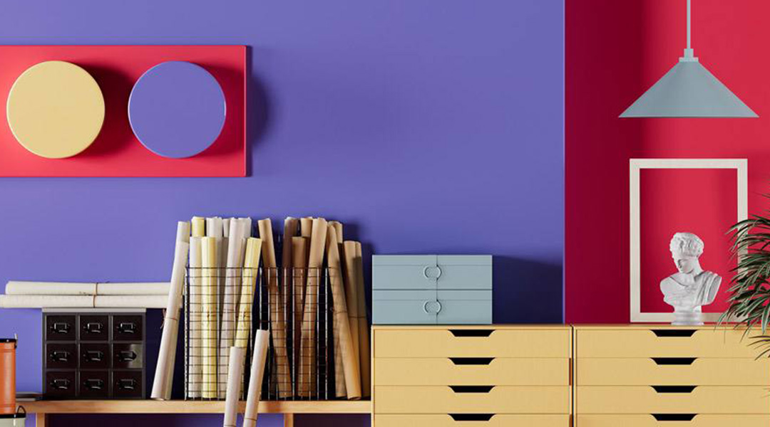
Designers agree that the best way to work with challenging colors like Very Peri is to use it as an accent. It can even be as simple as dotting your office with coffee mugs, scarves, and floral arrangement. Chat Fores suggests using the color for accent walls, accessories, or furniture pieces, especially for predominantly white or pastel spaces, which will provide a nice contrast.
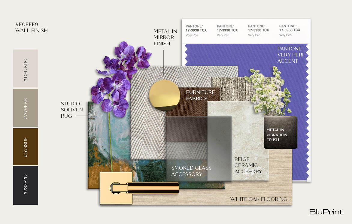
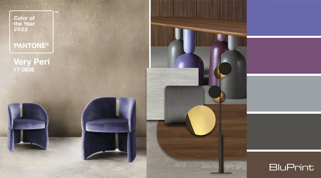
“Throws in cashmere, pillows in velvet, smoked glass decor, and rugs with Very Peri accents would add soft and pleasant touches in an office at home. To maintain the unisex image of Very Peri, I would use a highly pigmented paint either in a matte finish for an accent wall, or use a high gloss lacquer finish for a door or an archway. Another approach to use it is to paint the ceiling in Very Peri in a high gloss finish for a mirrorized, modern look.”
“Very Peri tends to be a more feminine color hue and a trendy color,” Cynthia also noted. “So, I will use this color primarily for accent pieces that compliments with neutral colors. I will also use this color for accessories.”
Want to experiment with accent pieces to add to your home office? Cynthia also suggests embellishing a corner with a grouping of vases for a sculptural look, or even painting picture frames and potted ceramics in this bold Periwinkle shade. Interior stylist and photographer Kitty Bunag also adds accent tables and chairs, drop lamps, artworks, and decking your gadgets with skins to the list.
For a touch of nature, Cyndi Beltran of Moss Manila says you can take it up a notch by adding fresh blooms. Look for purple vanda orchids, purple hydrangeas, lilacs, and hyacinths from a local flower market. These, she said, can also stimulate your creativity and brighten up your mood while working.
Mix and match with other colors — with caution.
The color is already tricky on its own, but the bigger challenge comes with mixing it with other colors. This is where evaluating your existing pieces and how it can potentially clash with them comes into play.
Rossy stresses that this shade may quickly look dated and gloomy if not used with the correct elements. “The best way to let this color live its full potential is by using bright and neutral tones like ivory and beige. In a transitional country setting, adding a few metals like nickel or brass finished details will be a great contrast.” Cyndi agrees, and loves how it’s versatile with metallics. “It’s one of those colors that can go well with silver, gold, champagne, and deep brass tones.”
Ivy’s quick tips will help you create your desired effect. Soften the effect by pairing Very Peri with ivory, oatmeal, or vanilla pieces. Brighten it up with citrine shades. Add some masculinity with black or charcoal grey. She also cautions against mixing the color with reds and rusty hues. “I would imagine that Periwinkle and reds may fight. Anything to do with red, burgundy, maroon, rust or a russet color could possibly not work.”
But if you’re still feeling experimental, Cynthia also has a few interesting recommendations. “Mixing Very Peri with green creates a very nature-driven and harmonious pairing. A lot of us became plant lovers during the pandemic. This combination echoes our desire to bring nature and the outdoors in.”
”Pairing it with white is very hip, graphic, and young. Keep white as the dominant color, but give it a modern take by using stripes, geometric shapes, and color blocking. This can come in the form of storage boxes, vases, plates, and coffee mugs. Very Peri with blue is a very calming and complimentary pairing. With pink, it creates a very bright and preppy combination that exudes happiness!”
Kitty, meanwhile, says that Very Peri is actually a versatile color. “Depending on your mood, you’d be surprised at how Very Peri can go well with anything! Add touches of silver or gold. Use black or white highlights. Mix it with mint or sage. Go bold with oranges, pinks, lemon, and chartreuse. You can even match it with mocha and browns.”
Pair with complementary patterns and prints.
Aside from color combinations, designers also recommend incorporating Very Peri in patterns and prints. It’s an easy yet effective way to play with this hopeful hue while making sure that you don’t go overboard. For example, instead of painting an entire accent wall, you can deck it with a Peri-patterned wallpaper. If you decide to go for a big accent piece, you can jazz it up with some accessories in complementary colors and patterns.
To add to the mix and match of pieces, Chat would mix prints in the form of throws, pillows, rugs and even lampshades. Adding in other bold elements like a few gigantic tassles, funky artwork, Ming blue and white ceramics, Japanese Imari giant plates, multi colored glassware, and even animal prints, she said, will also work.
When working with prints, however, Cyndi advises against using a complicated pattern with Very Peri. “Using Very Peri in a complicated pattern as a background for your zoom meetings can get very distracting,” she cautions.
Kitty sums everything up with a quick tip. If you wish to start with one accent piece, resist the urge to match everything with it. “I’m not saying to go full eclectic. You could but also, there is no need. Either you go full on Very Peri-ing the entire space, or choose a big accent piece then repeat the color in smaller ways to create balance. But really, stop overthinking. Your space, your rules. If you put together something that you love to wake up to everyday then it’s going to be okay.”
