Sivak+Partners Studio Incorporates Metal Waves Into The Interior of This Ice Cream Shop
Food establishments today not only have to have a mouthwatering menu. The interior of the place has a huge factor in attracting customers. When coming up with the design of the shop, the idea often comes from the name of the establishment and its specialty. That was how Sivak+Partners Studio got the inspiration when designing “ТАЮ,” an ice cream shop in Odesa, Ukraine.
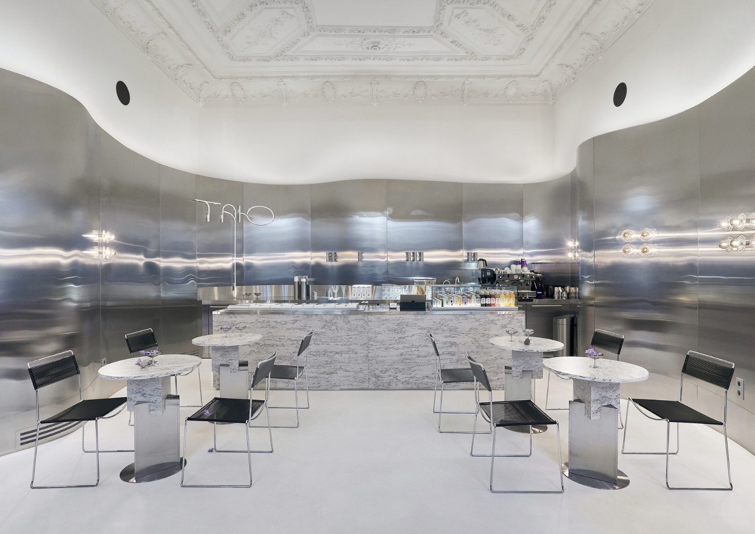
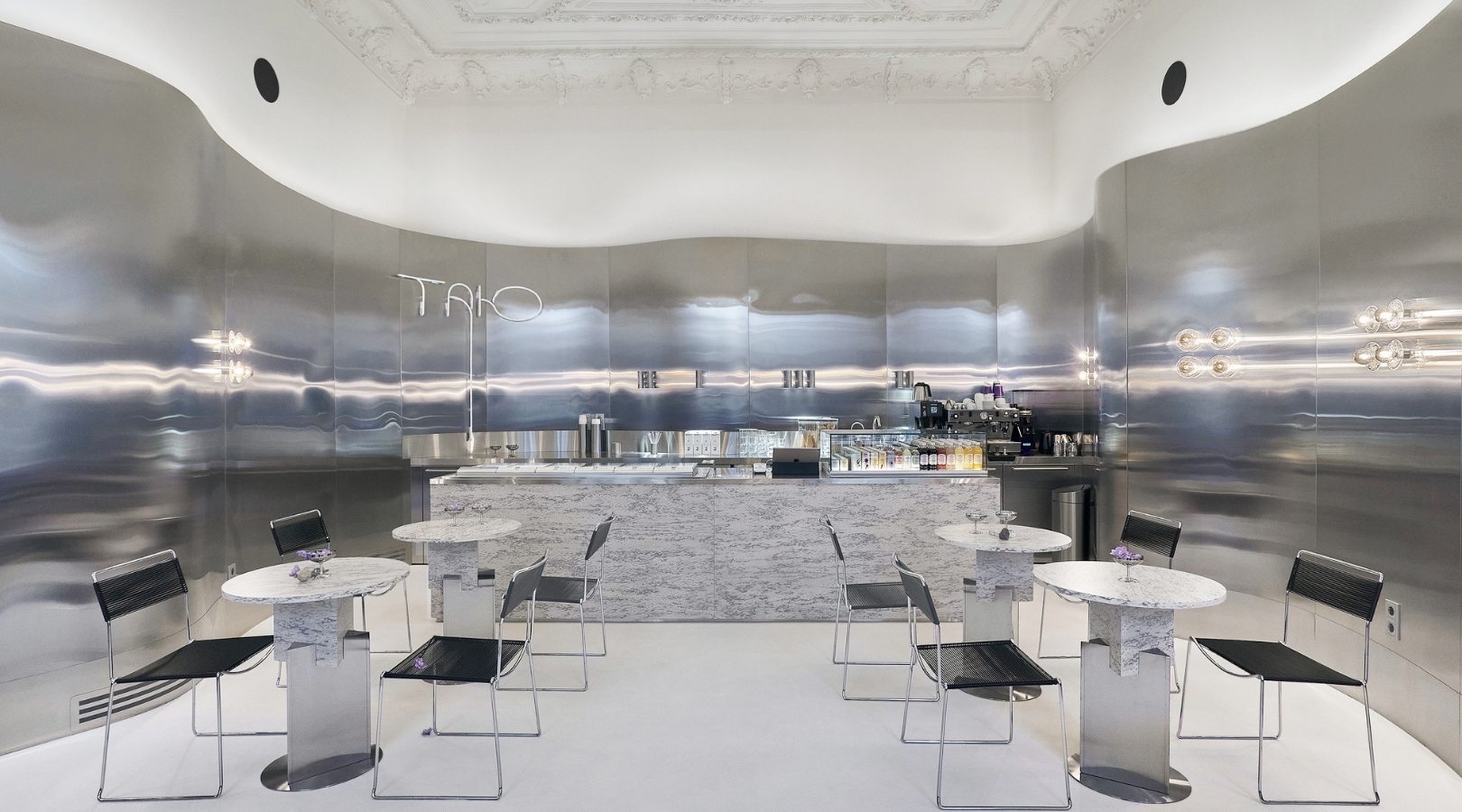
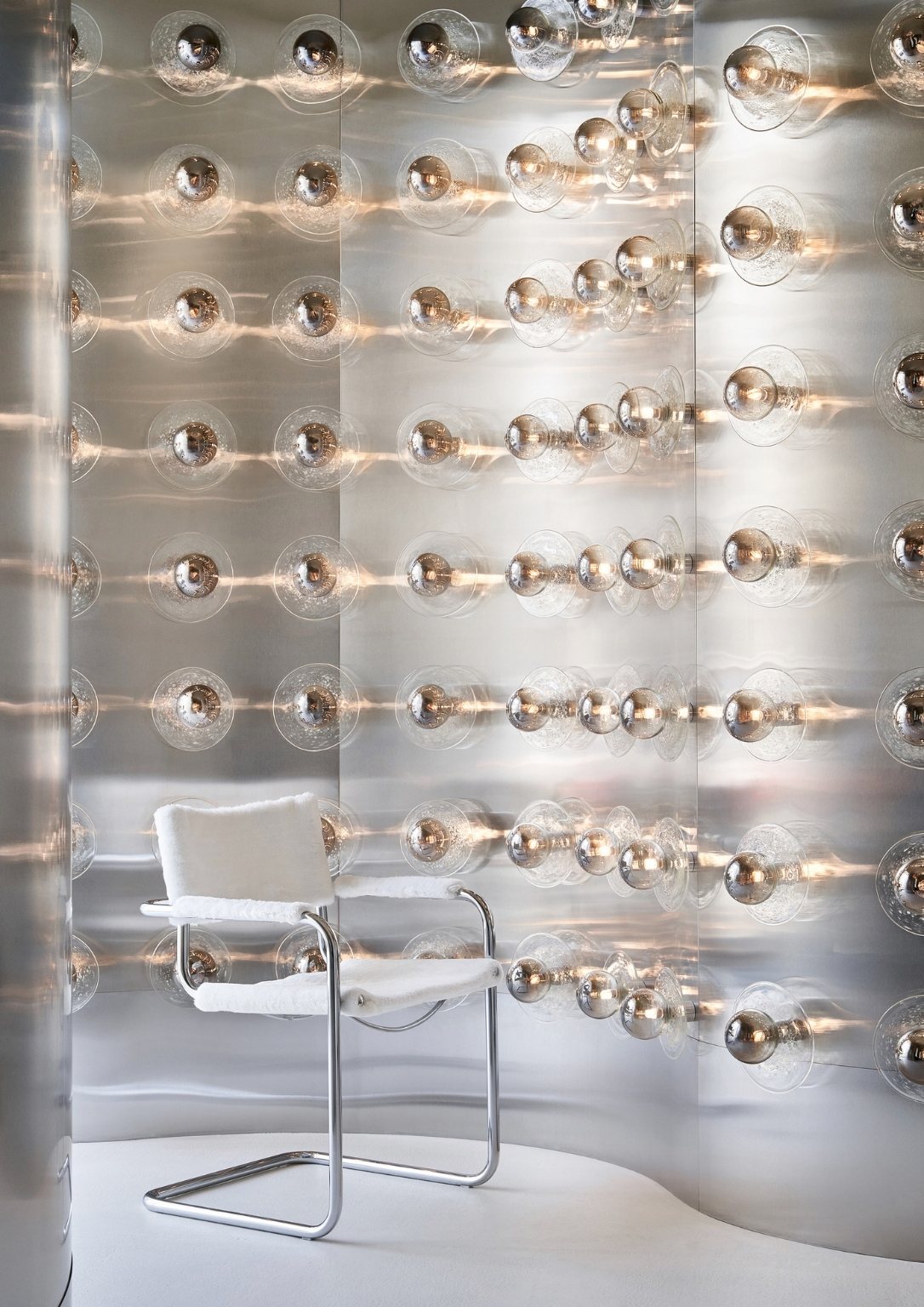
ТАЮ means “I’m melting” in Ukrainian and the shop serves ice cream and juices. The designers wanted to create and unite the whole interior using a simple solution, simple materials, and one clear idea.
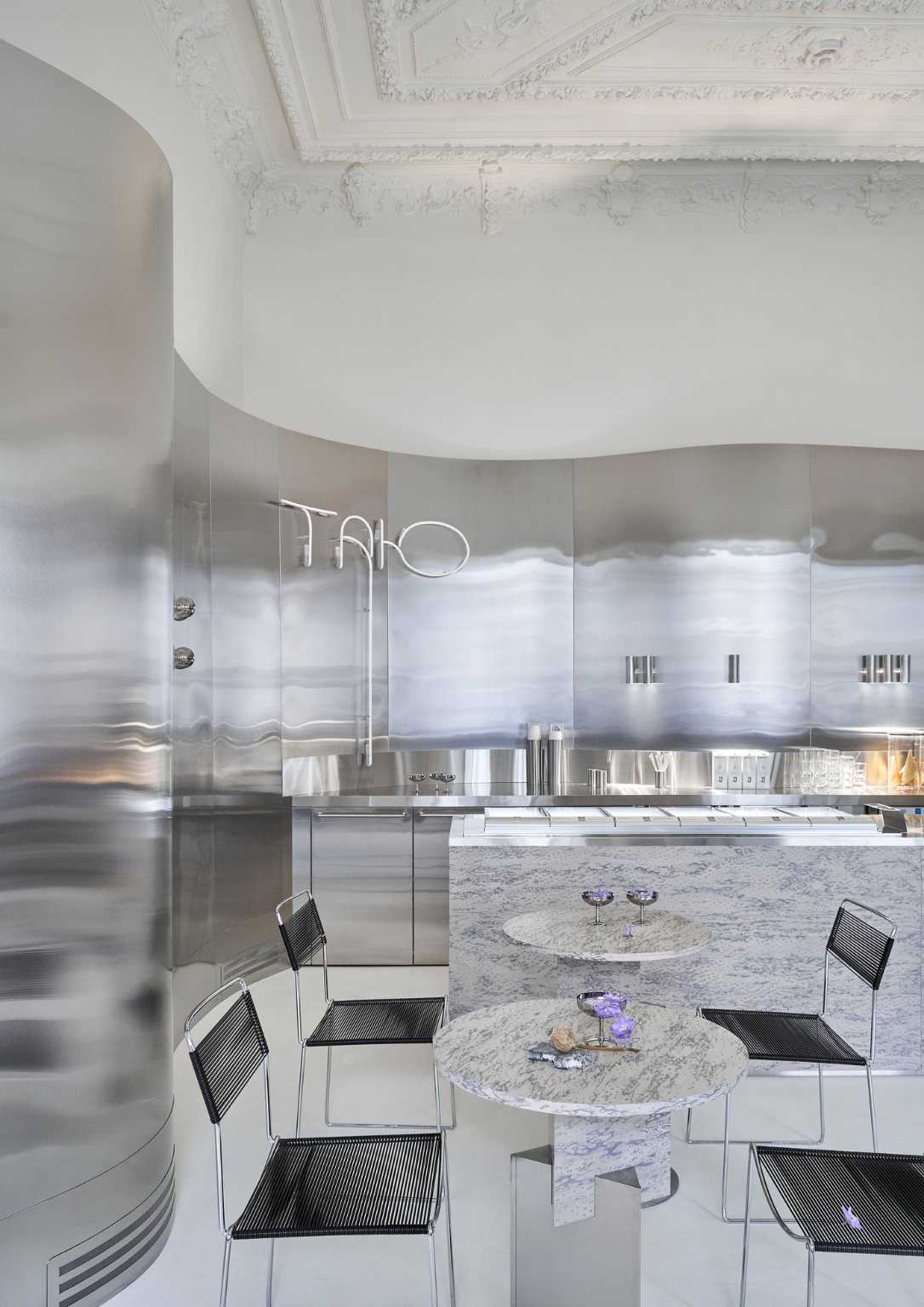
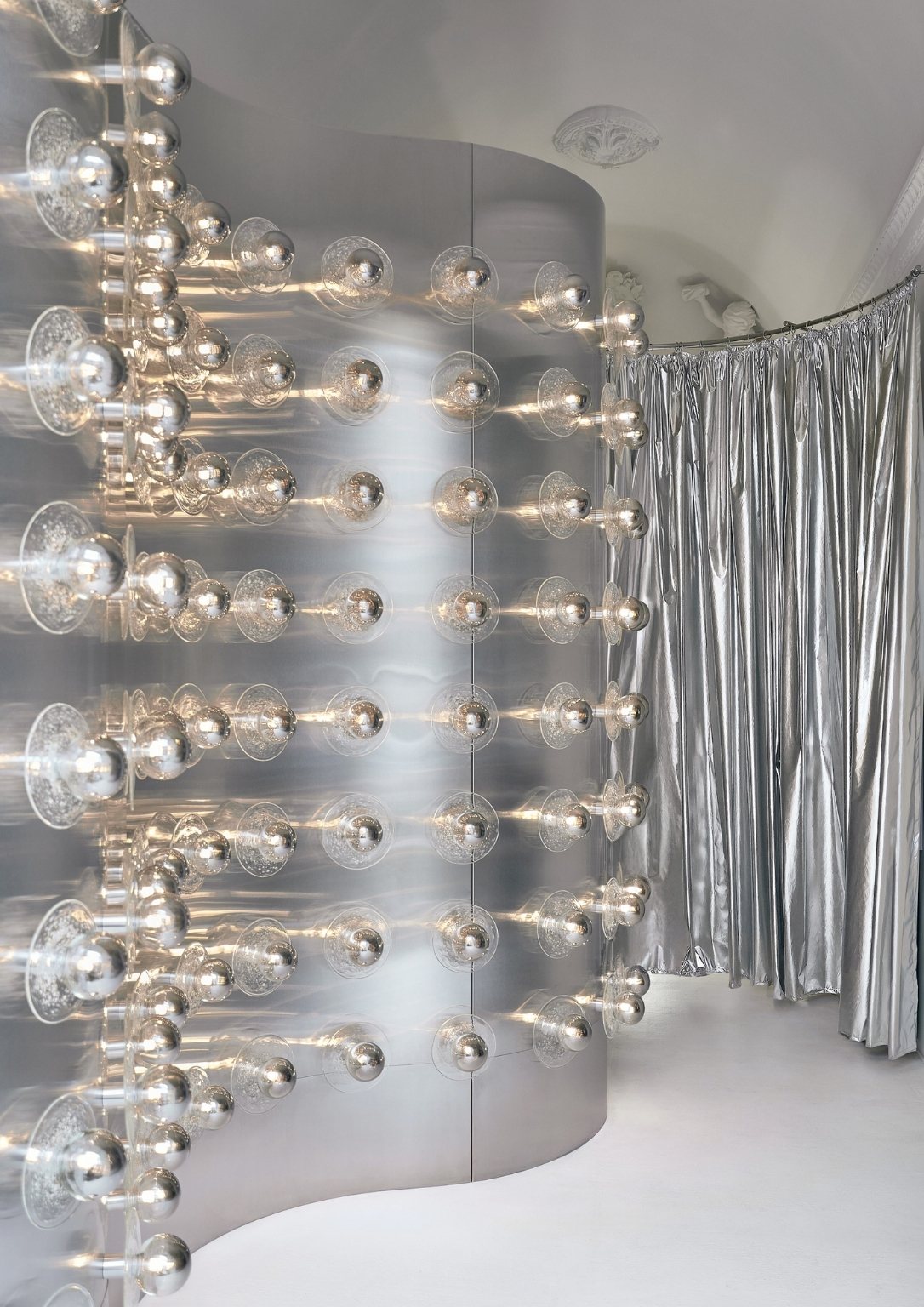
The studio explained the name and the ice cream itself gave them the idea. “The ice cream melts, the architecture of classicism melts, and its massive decorative ceiling flows down into the smooth curves of the metal walls. Whereas classic architecture is subject to strict rules and rhythms, modern non-linear architecture, and metamodernist design are devoid of strict rules and are more daring in their use of materials and solutions.”
The ice cream shop sits on an old, historic building, which strongly influenced the design and technical decisions. Paying attention to the context plays a crucial role in the design process. The studio has to work its way around the ready-made, decorated ceilings. Instead of demolishing them, the studio decided to keep them and let them be part of the overall concept.
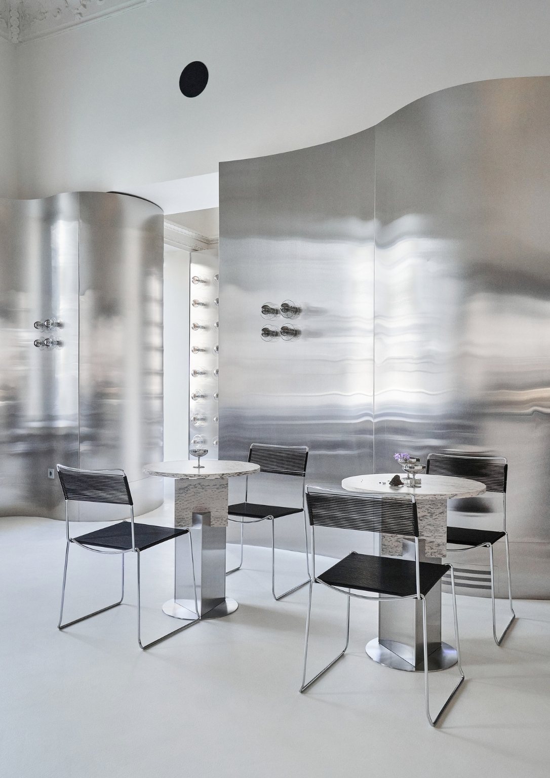
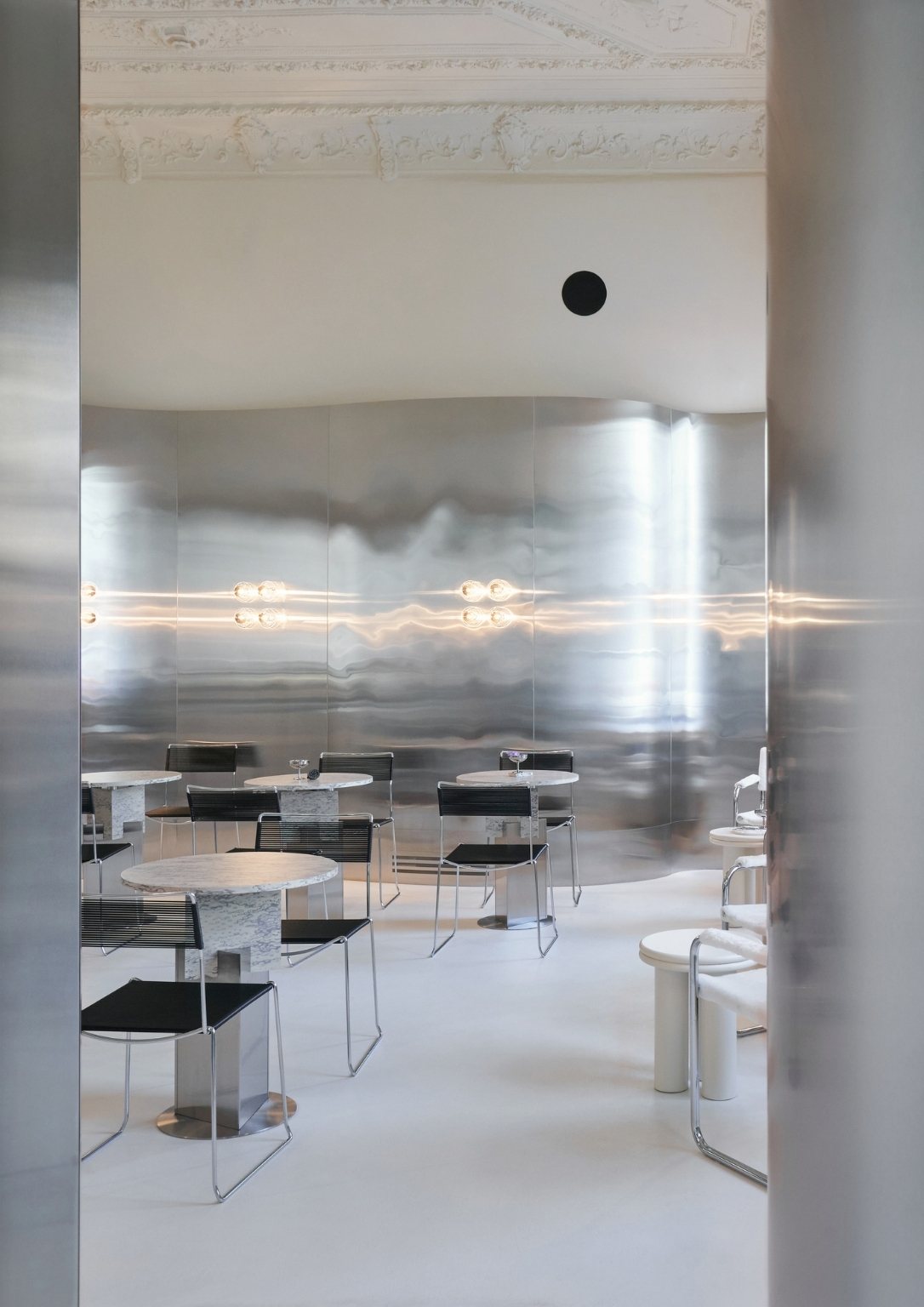
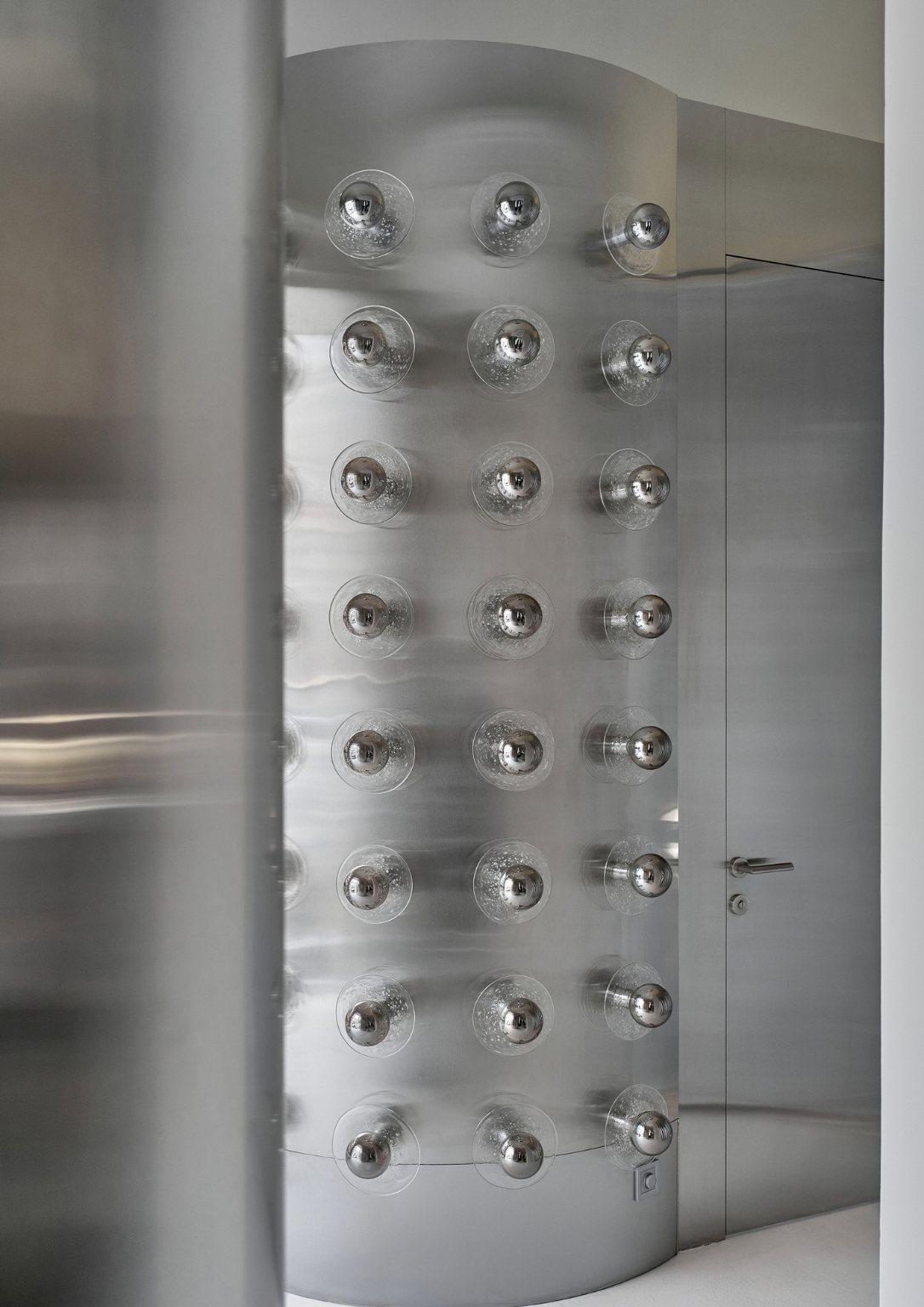
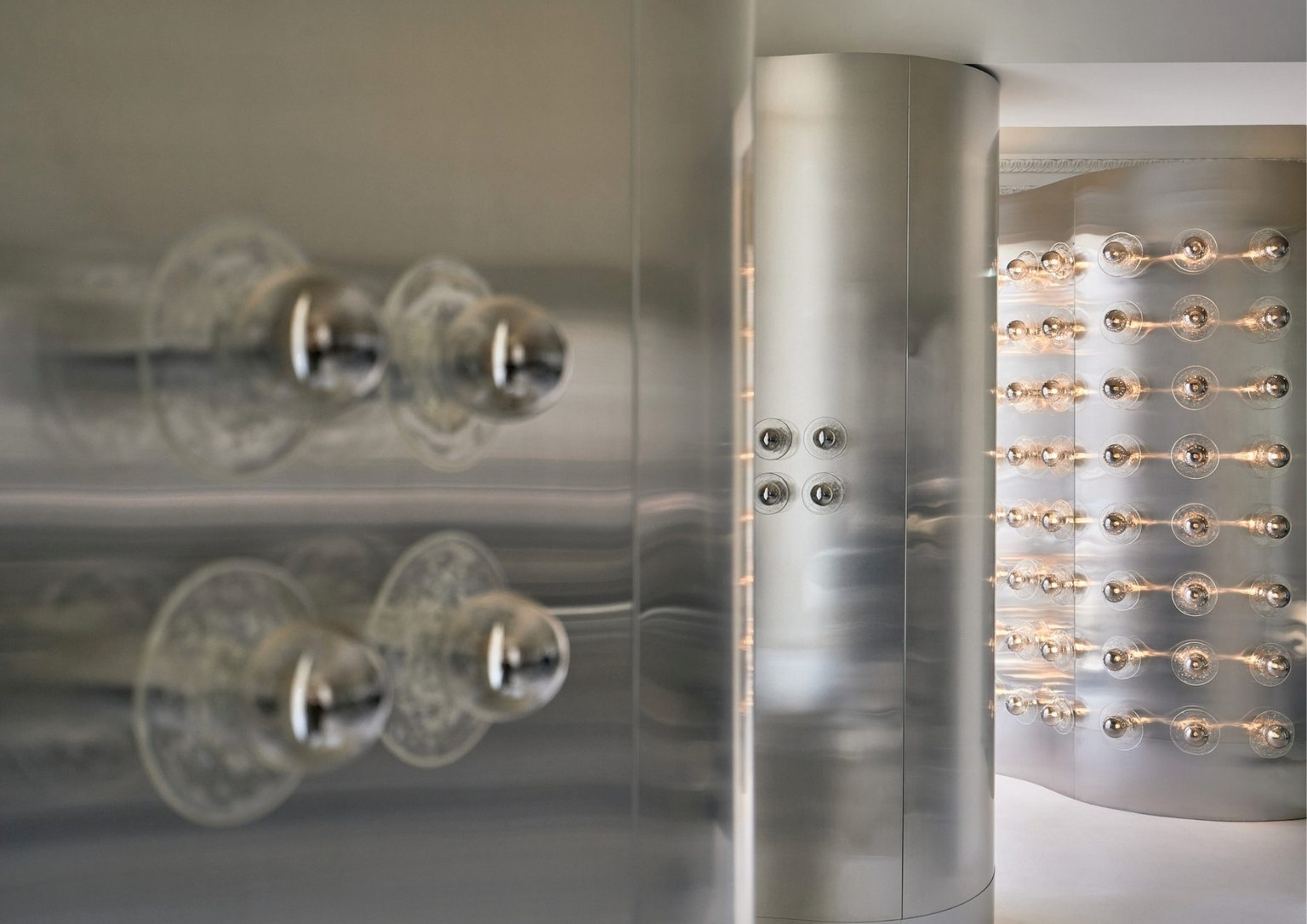
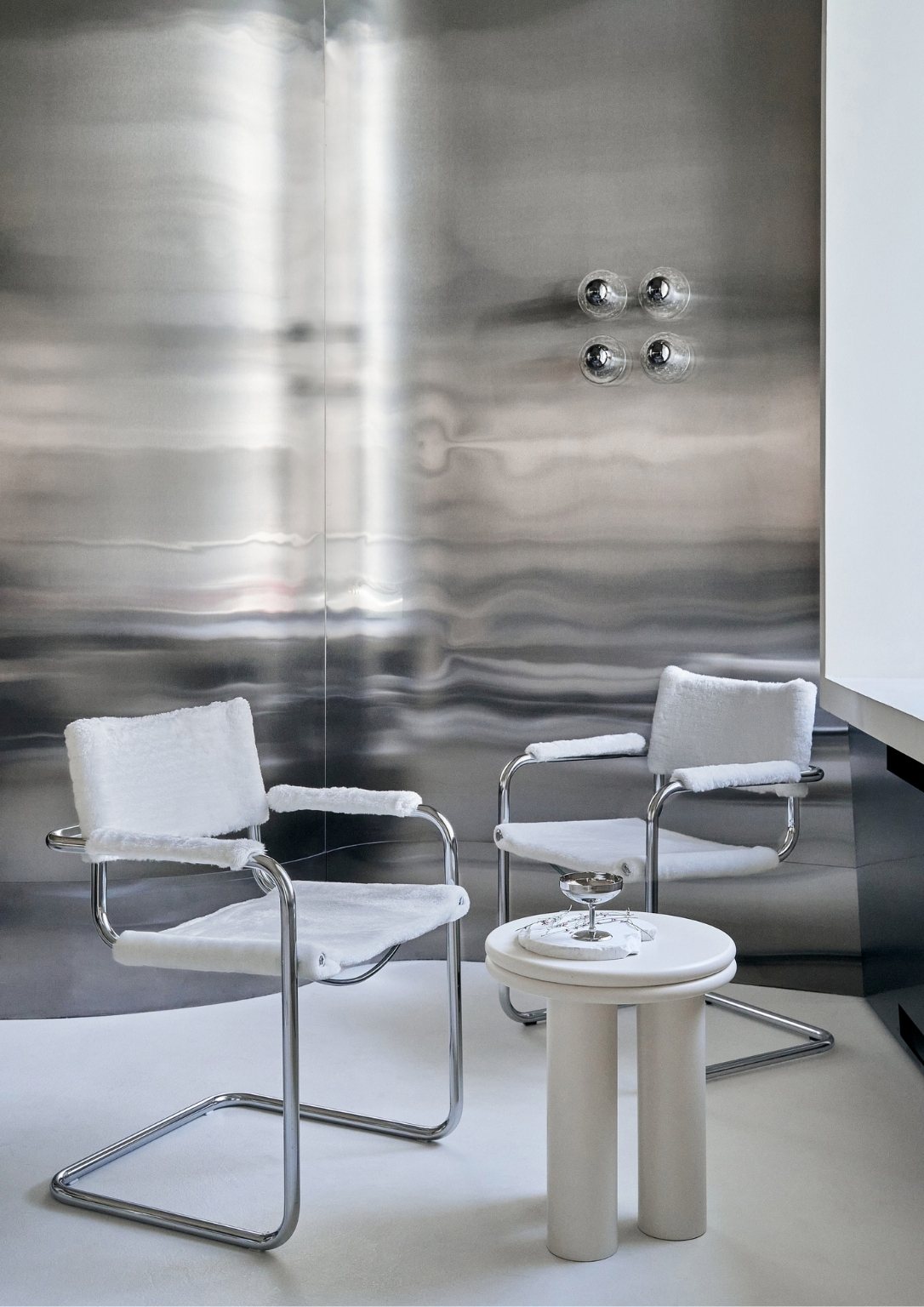
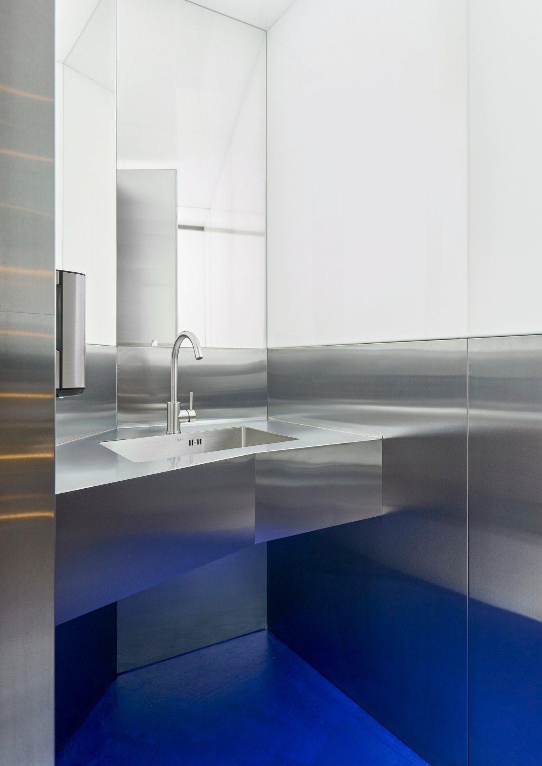
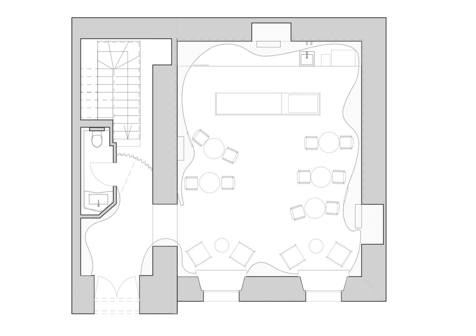
Moreover, the windows in the building would not open. The large, beautifully decorated ceiling also would not allow itself to be spoiled by the sight of the ventilation ducts. Otherwise, the design of the ceiling would have lost its elegance and sophistication. To avoid this, the studio placed the supply and exhaust vents behind the metal waves on the wall. Installing one solid metal wave improved not only the aesthetic of the interior but also minimized its timing.
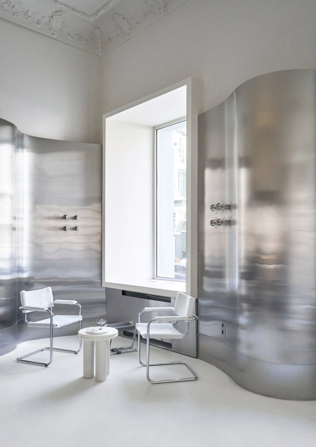
The studio specializes in modern designs. That is why working with the richly decorated traditional ceiling that was given to them was challenging for them. They had to incorporate it into the overall concept. It links the interior, the house, and its history.
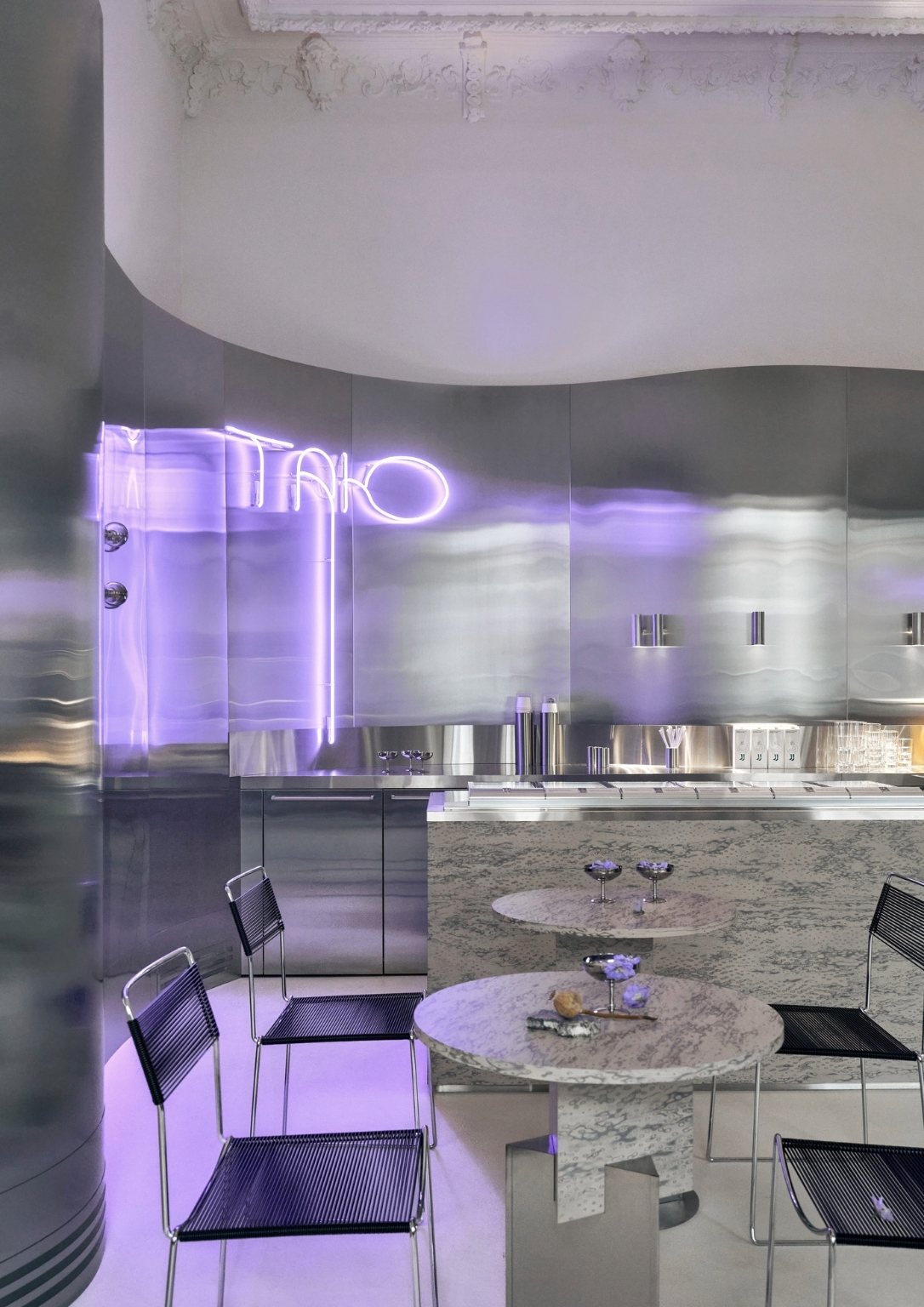
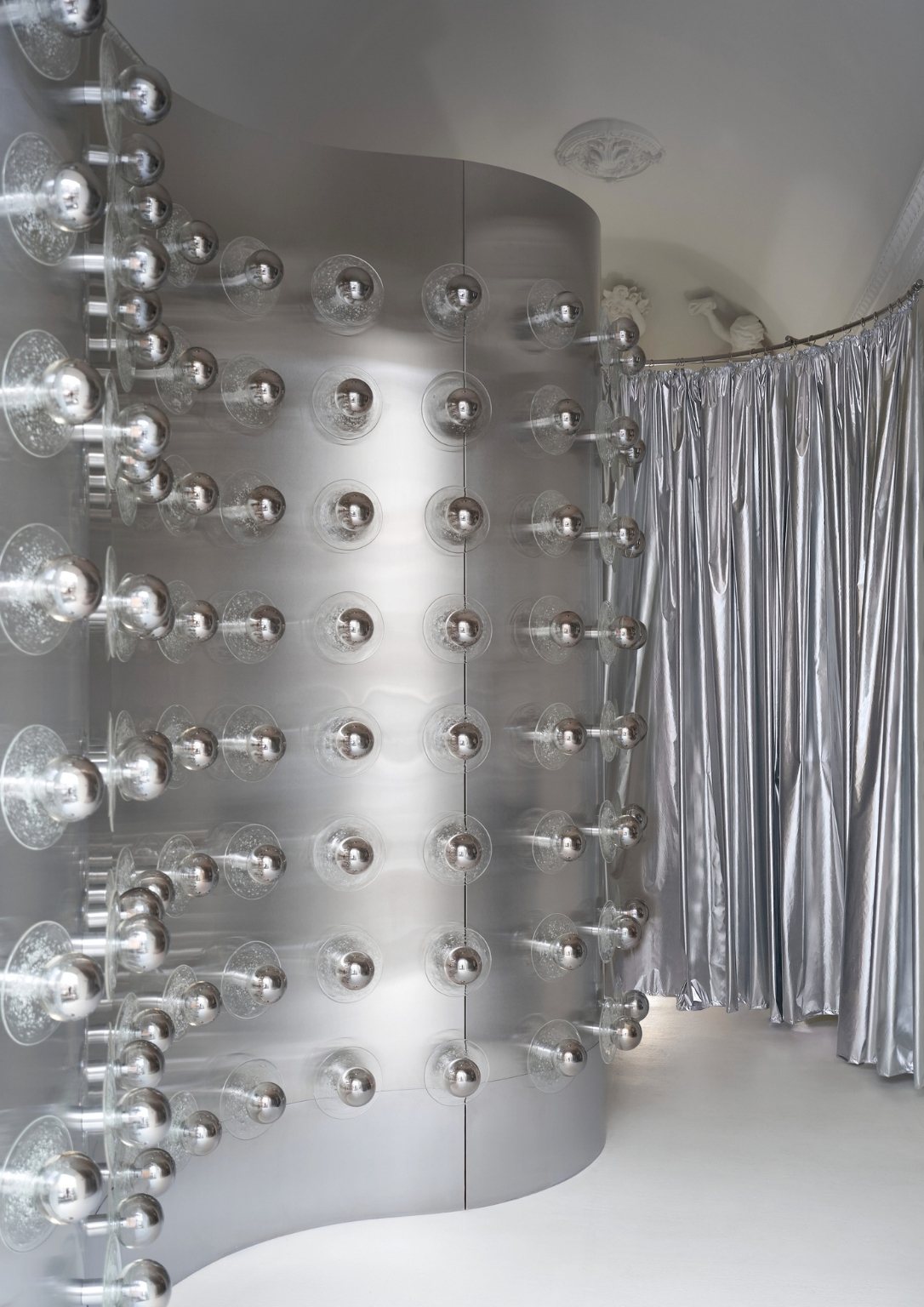
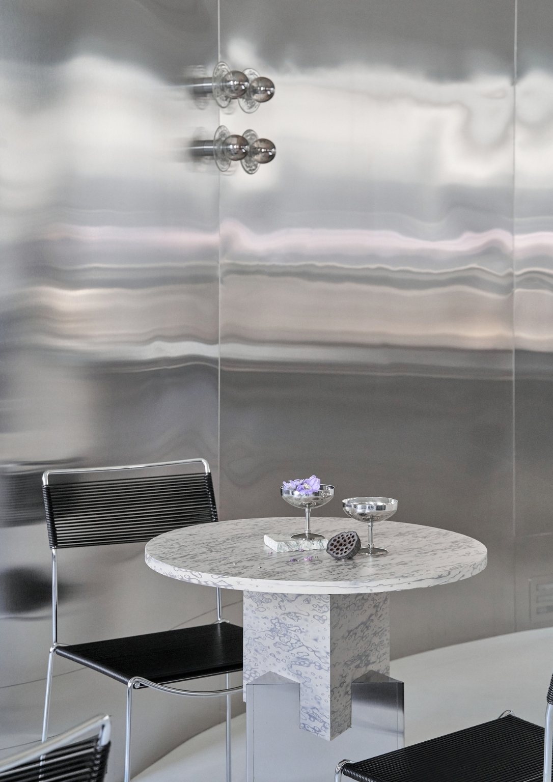
Purple is the primary color of the concept. The studio used the color that lights up the logo in the interior and the entire room. The multi-card reflection of purple changes the appearance of the space.
Photos by Yevhen Kariev
